Brainstorm
The assignment was simple: in a packaging class we were told to redesign an existing package to produce less waste. My first thoughts were that I wanted to create a brand for my package to give me guidelines while I design the package holistically. When thinking of wasteful packaging, my mind jumped to all the plastic used on airlines in the small pillow, socks, and eye mask packages. I started my research by looking at all the brands that exist on airlines, and I was drawn to the punchy pink WOW airlines uses. The color made me think of large bold colors and numbers against white. I realized that while I'd be able to play with shape of packages for this idea, the brand would all be very similar from piece to piece, and my enthusiasm dwindled.
The concept
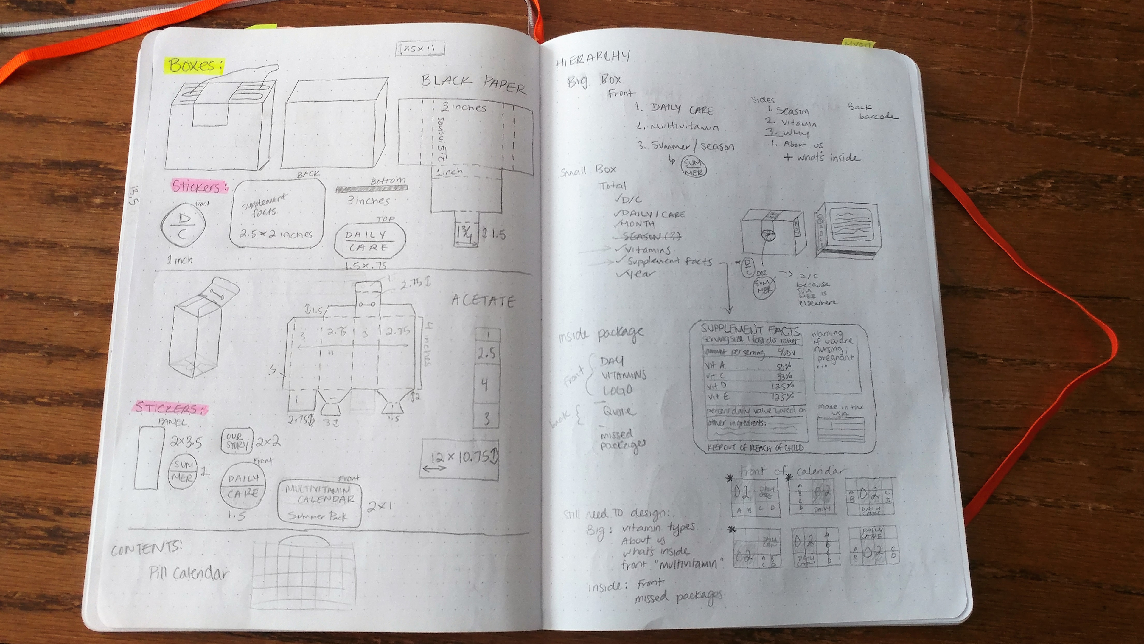
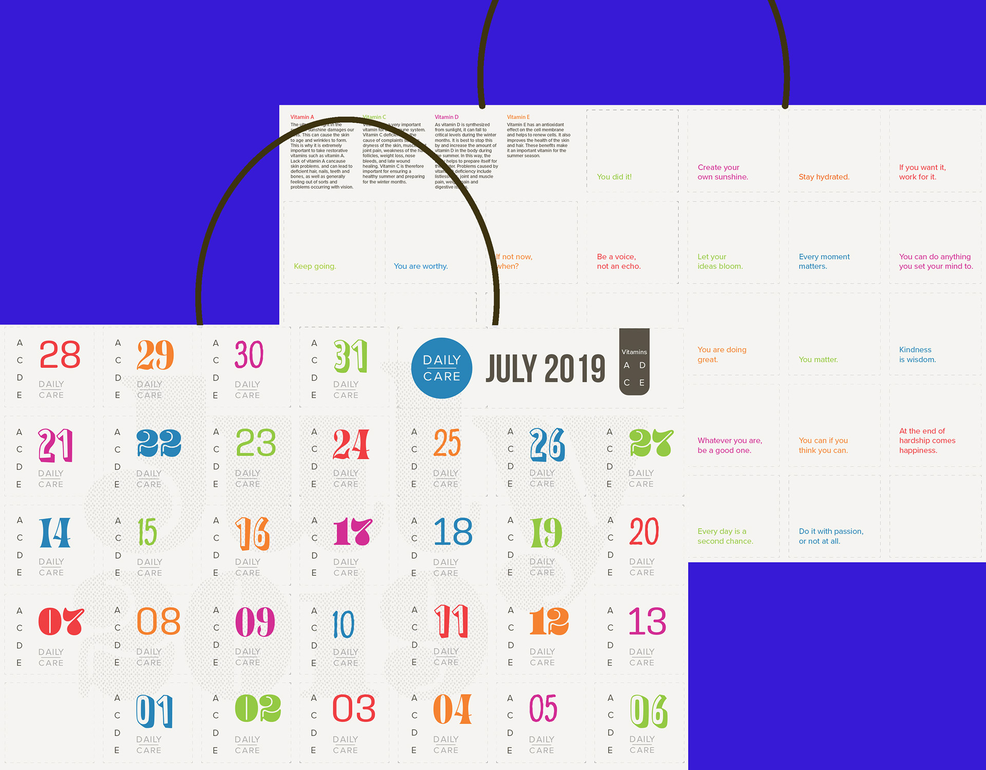
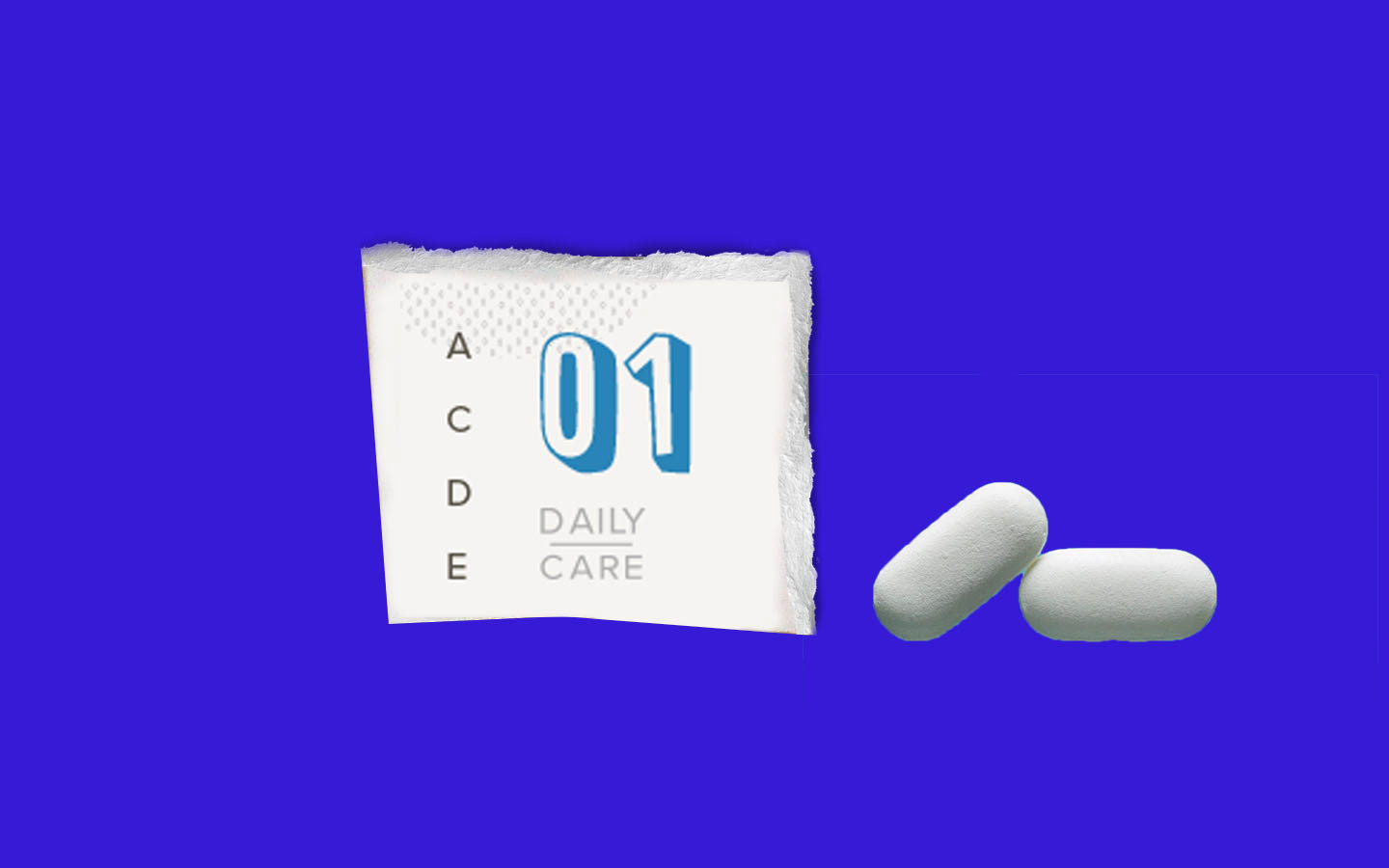
I was excited about the idea of numbers on white so I was thinking of how I could use that. I thought to make individual numbered packets of something. OK so what would I need individual packets for? Protein powder. Those packages are usually extremely bulky and plastic and surely get wasted a lot. But how could I justify making individual packets for something that could be in one? So I thought of vitamins. There could be a different mix of vitamins in each packet, and the packet could be useful. The numbers could indicate the date - why don't I make a calendar? The numbers would tell you if you've taken your vitamins. They could be more functional by having a piece of information on the back - fun facts or motivational quotes.
The package
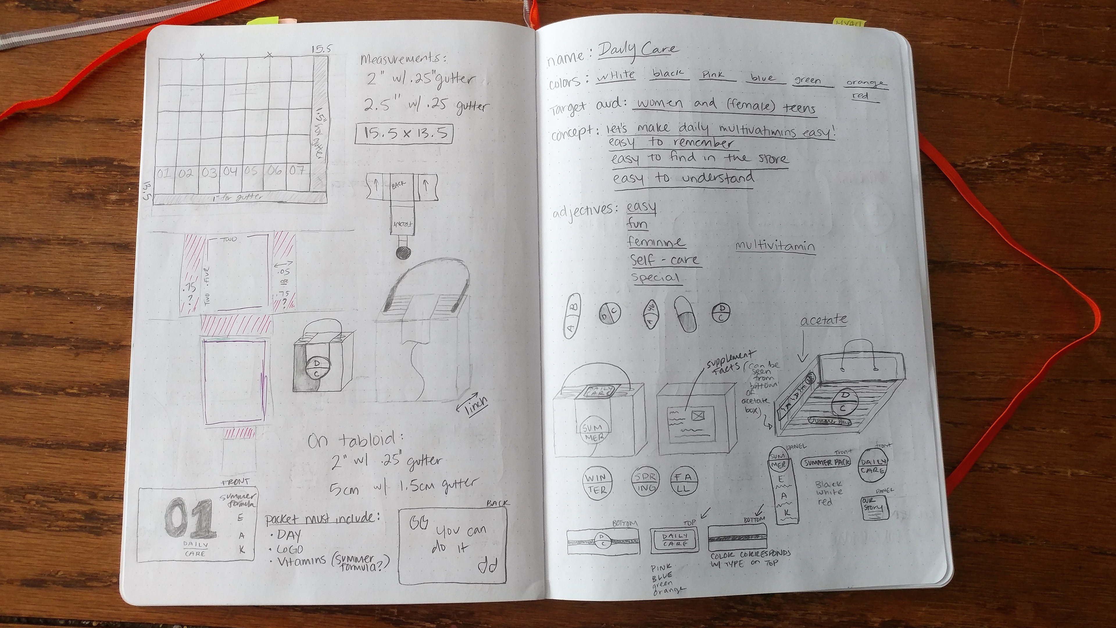
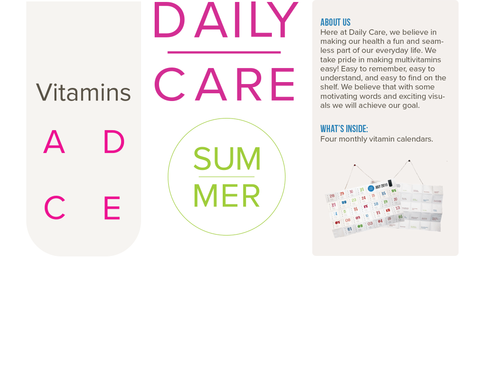
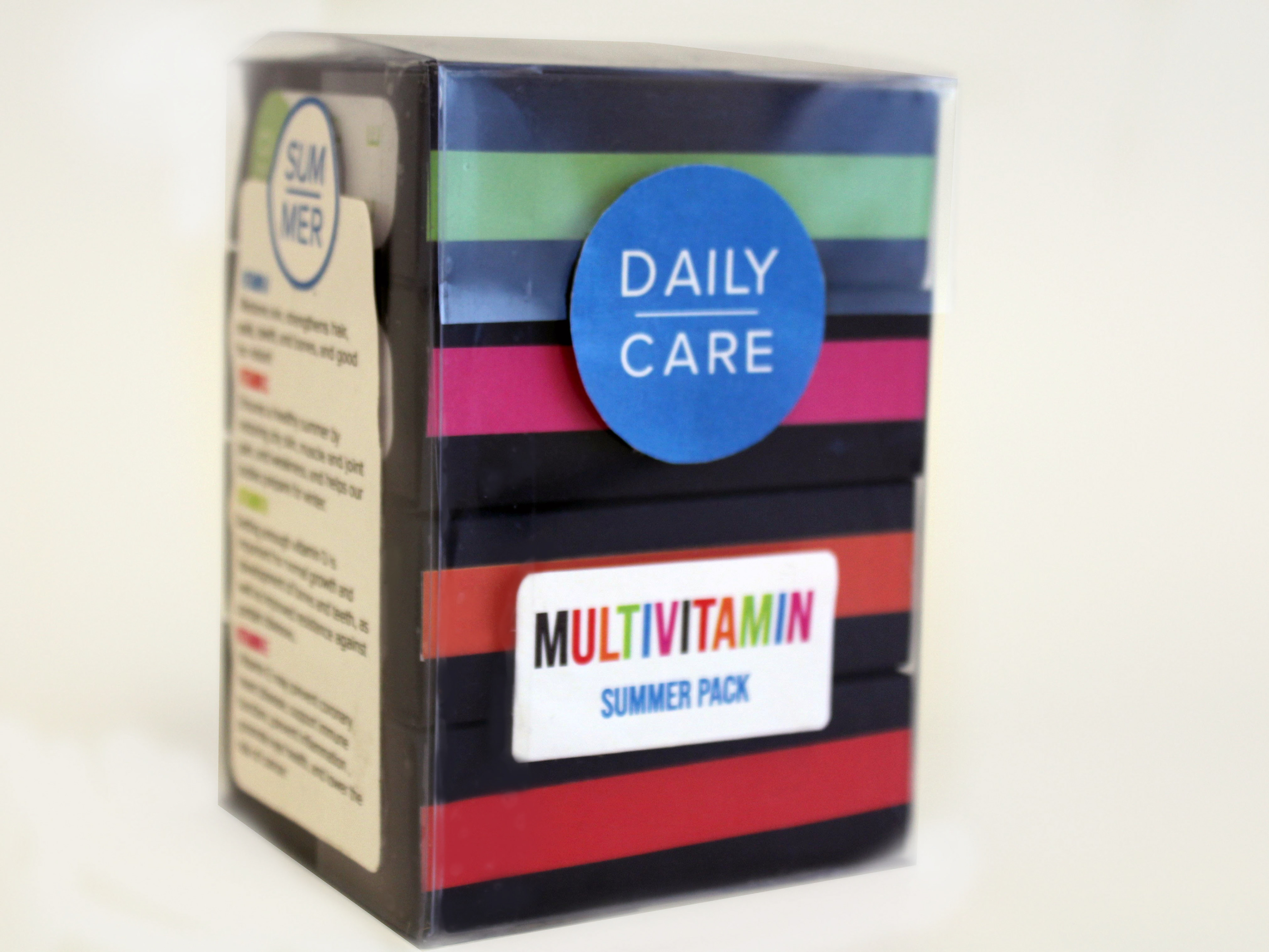
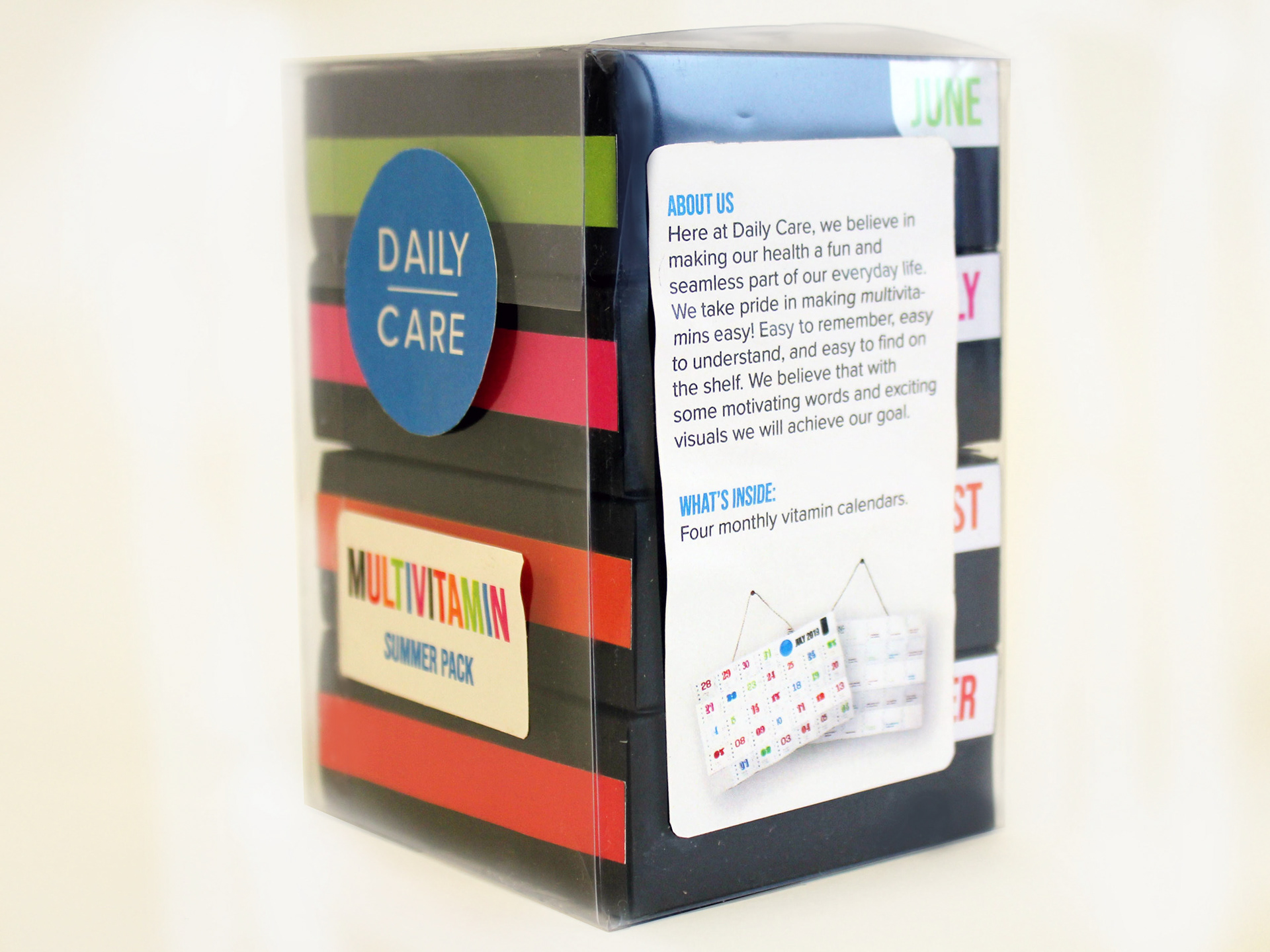
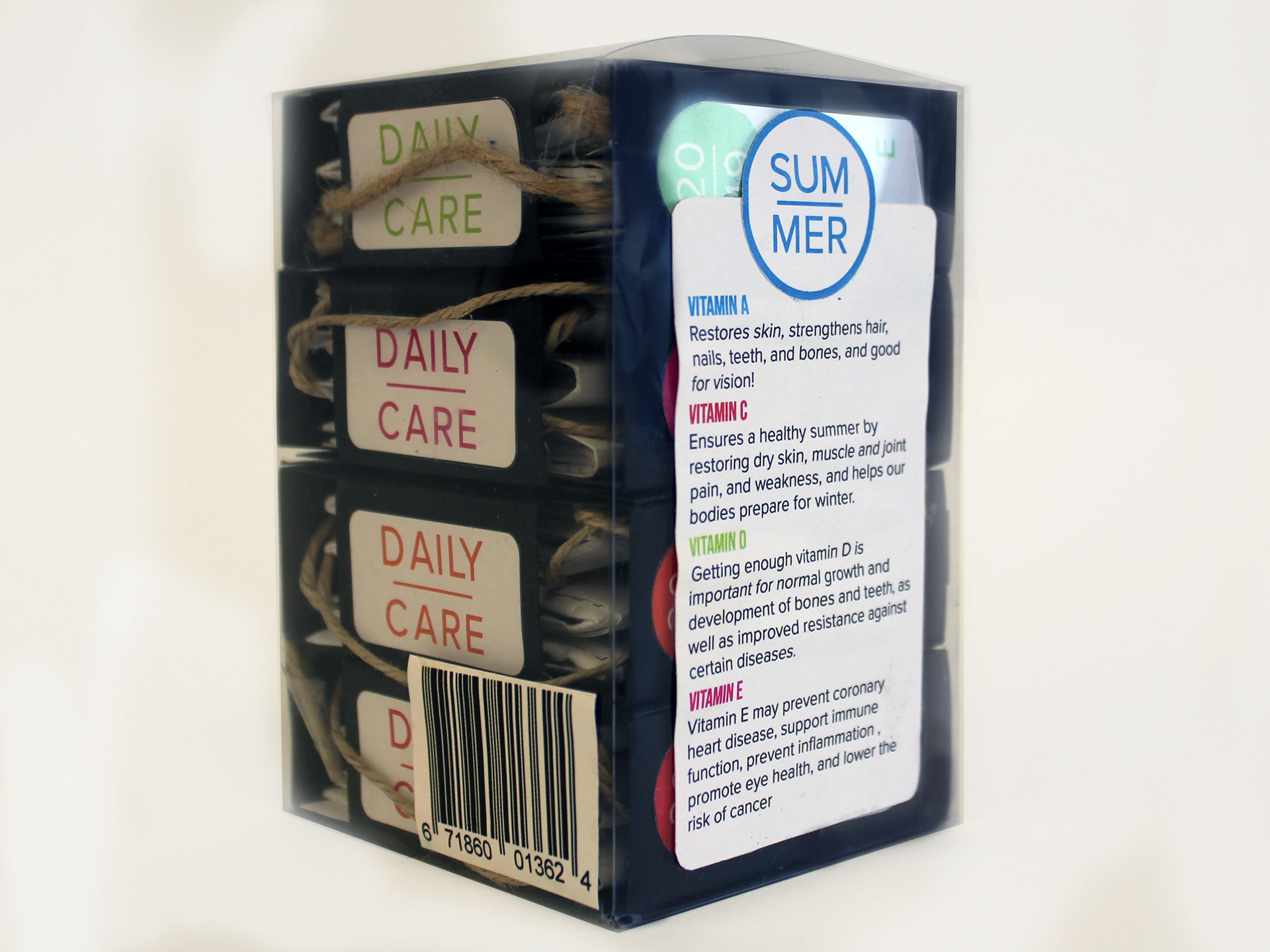
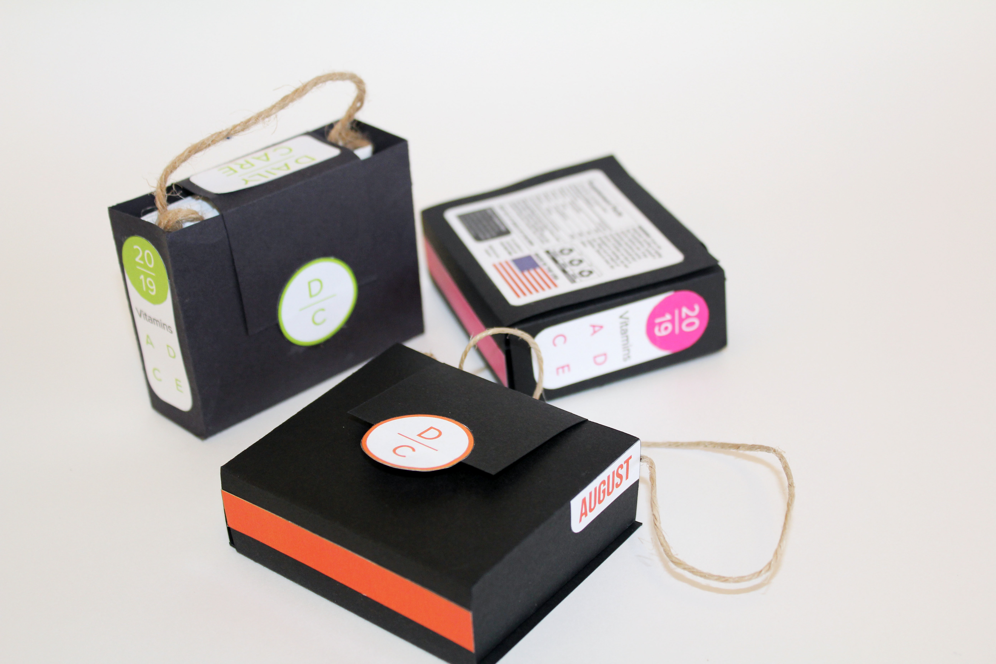
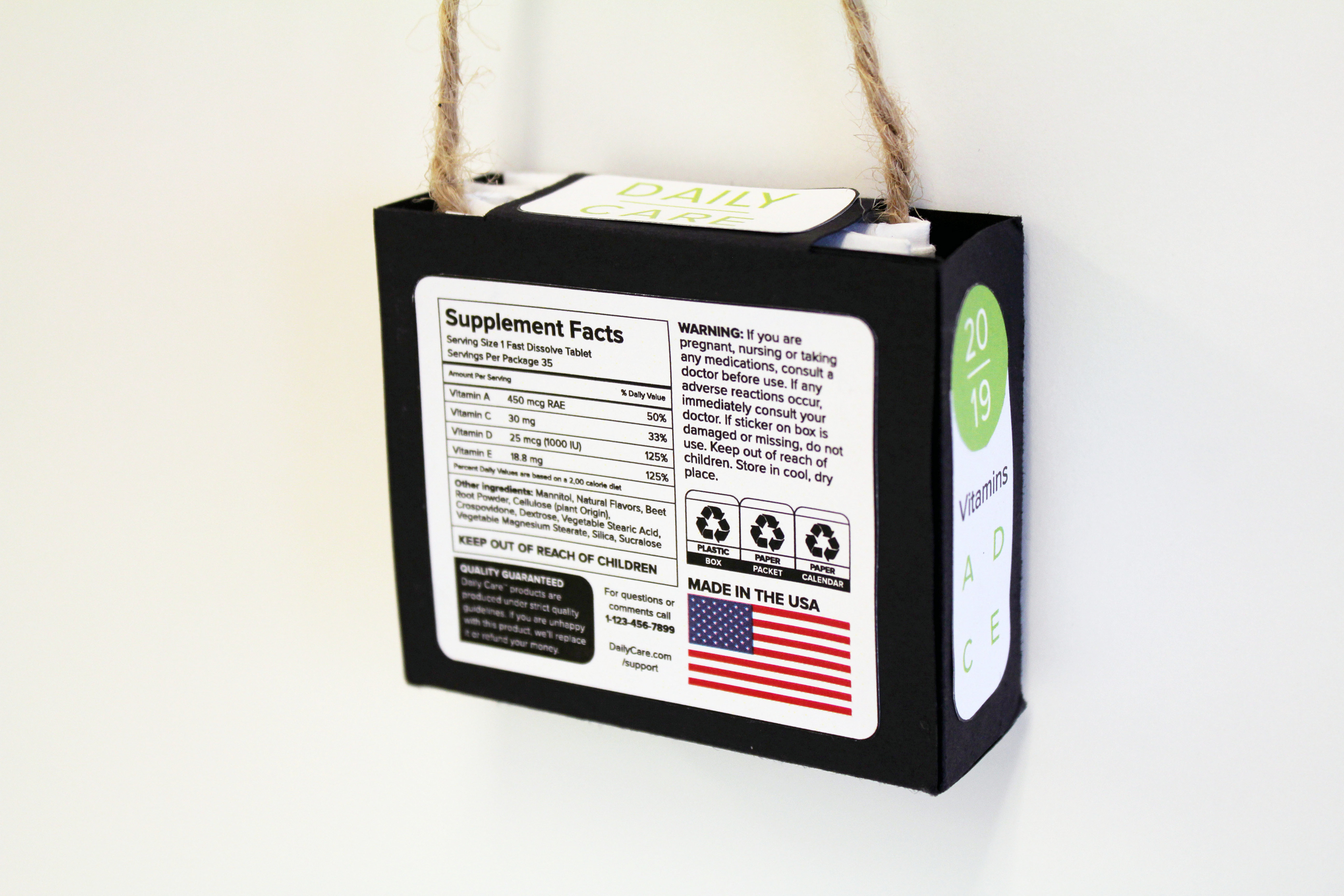
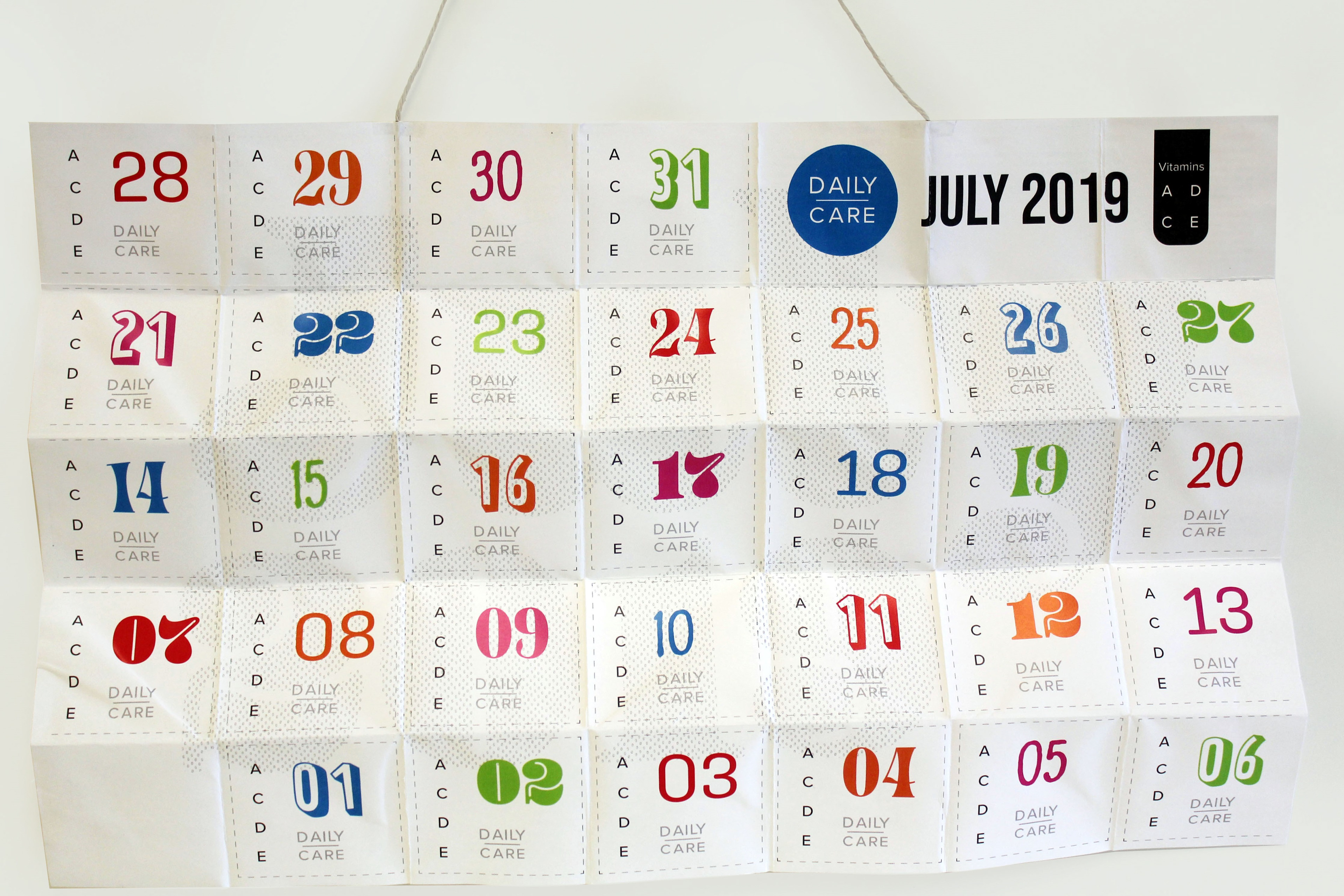
So each calendar would have to be made for that specific month in order for the numbers to be on the right day. If each month is designed specifically, maybe the vitamins could reflect the time of year. So I made seasonal packages. The summer pack includes the four months of summer (this holds more vitamins than a 30 or 90 day bottle of vitamins, thus reducing waste). The labels on the package describe which vitamins are included in the package, and why they are good to take in the summer months. A second label describes the brand (Daily Care, which I invented to give me structure in the design process), and includes an image of a calendar inside since it is not clear from looking at the package alone. I also designed a nutrition facts label to include vitamin percentages and proper warnings.
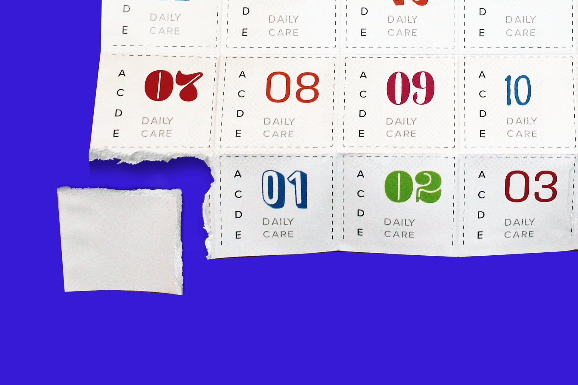
The calendar itself is composed of two pieces of paper sandwiched to hold in the vitamins. A potential user would rip off the packet of the day, read the motivational quote, and take their vitamins. One problem with the calendar is that if it started counting down at the top right corner, like a traditional calendar, one could not easily tear off the right date, and after the first week, the calendar would not longer hang up. So the calendar had to start from the bottom left corner.
This packaging is designed to replace chunky plastic bottles in an effort to save the environment.
The Brand
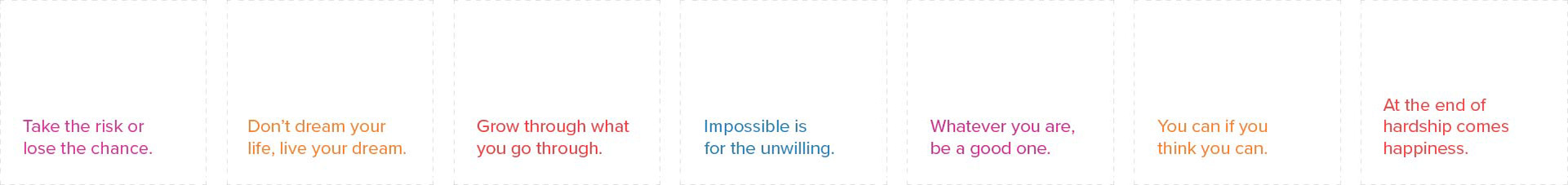
Daily Care is a brand that focuses on making daily vitamins fun rather than a chore, and attempts to creatively remind consumers to never miss a day. Motivational quotes and clear explanations of which vitamins are included in each pack as well as why they are good for you are key points in this packaging. Each box comes with a four month supply, designed for each season.

Color + Type
The color palette is designed to catch the attention of a customer who is bombarded by thousands of vitamins and supplements on the shelves. Intentionally gender neutral, this palette is lighthearted and fun,
I used many typefaces throughout this project, especially in the treatment of the numbers on the calendar. The idea is to make vitamins fun and to distinguish between days, because we all know how hard it can be to remember to take daily pills.
Apart from the punchy numerals, I used Proxima Nova for the type. I used this typeface because it is clear enough for people to read it on the shelves, and because it shows up well in color (helpful on the motivational quotes).
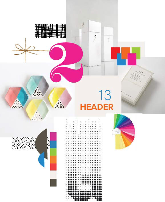
The mood board + preliminary sketches: