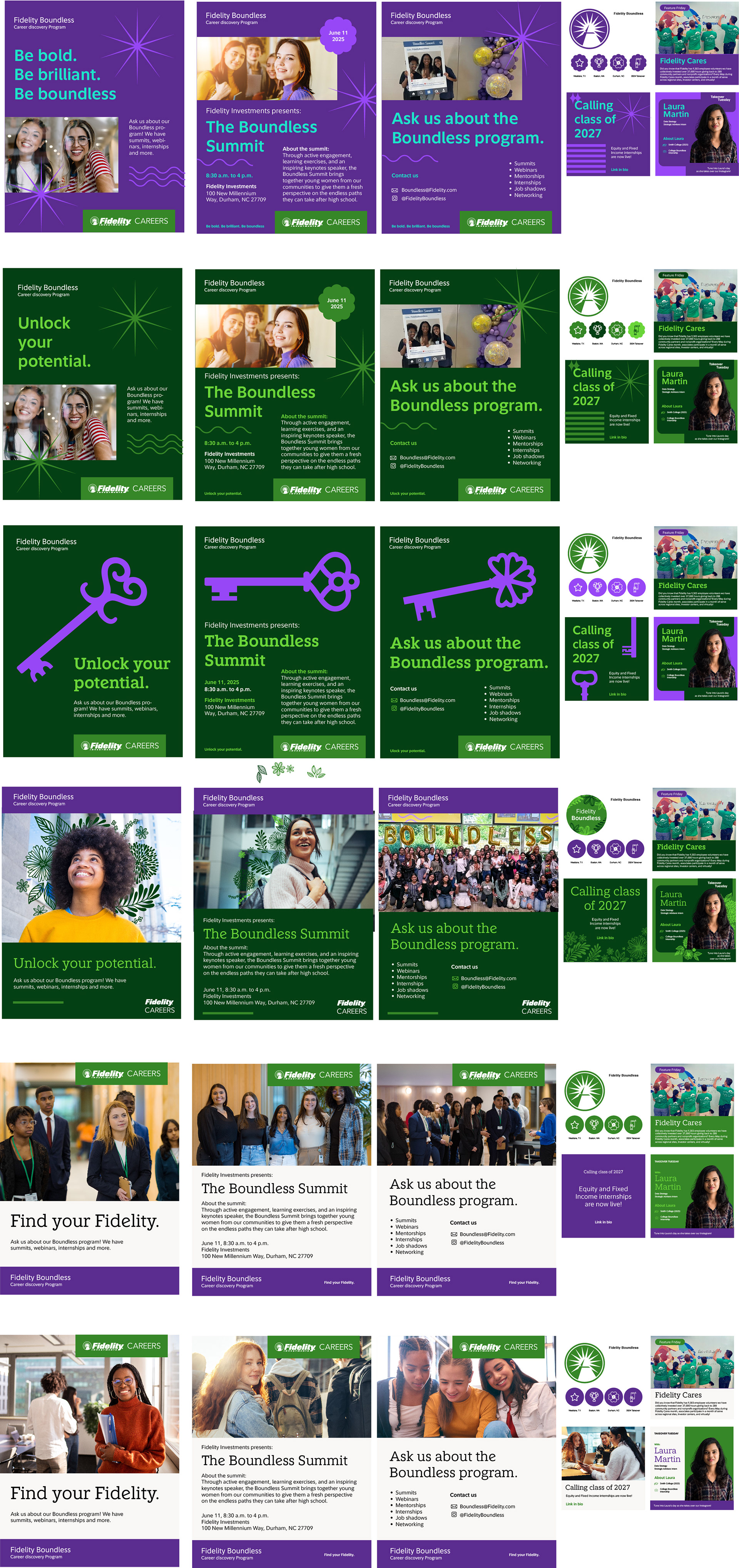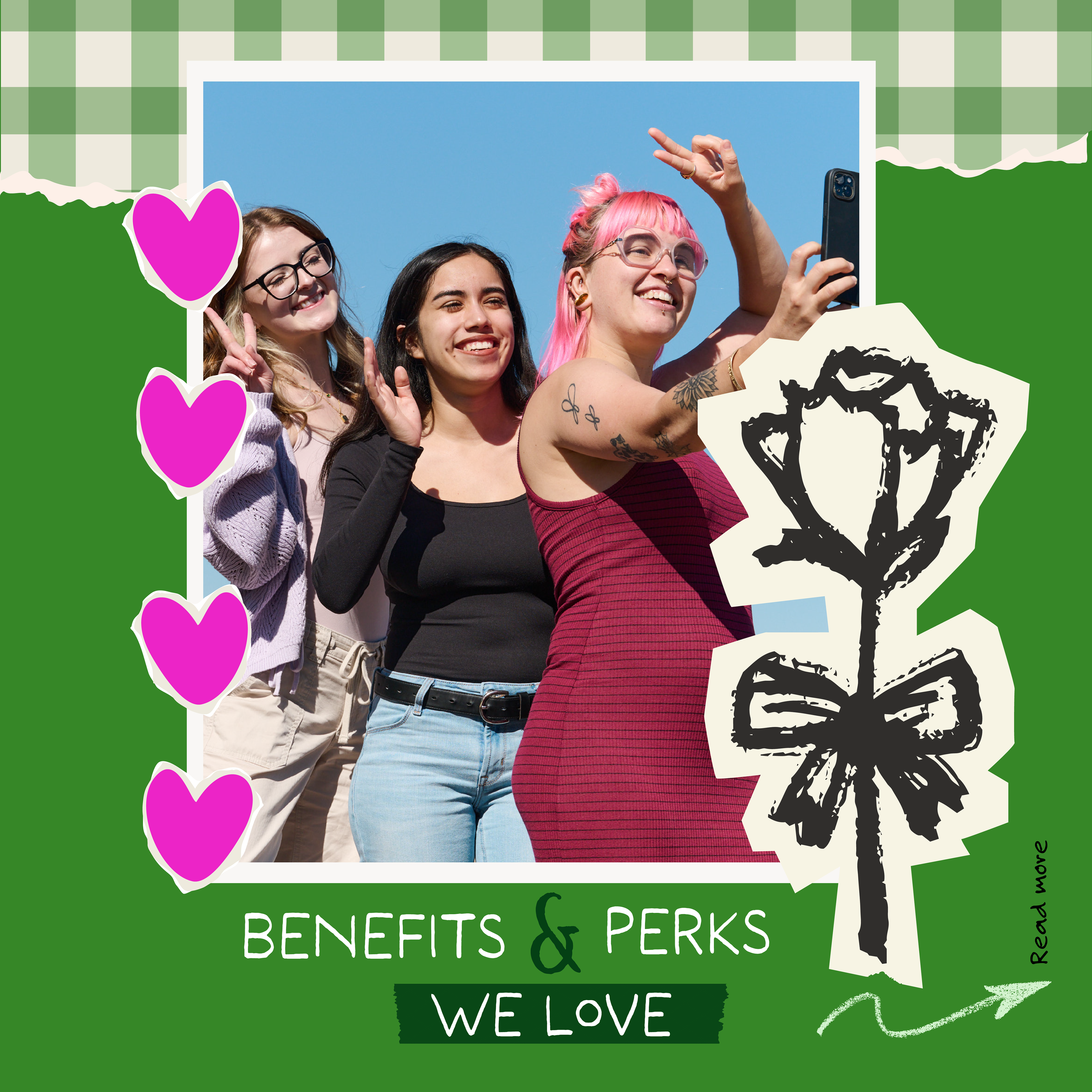

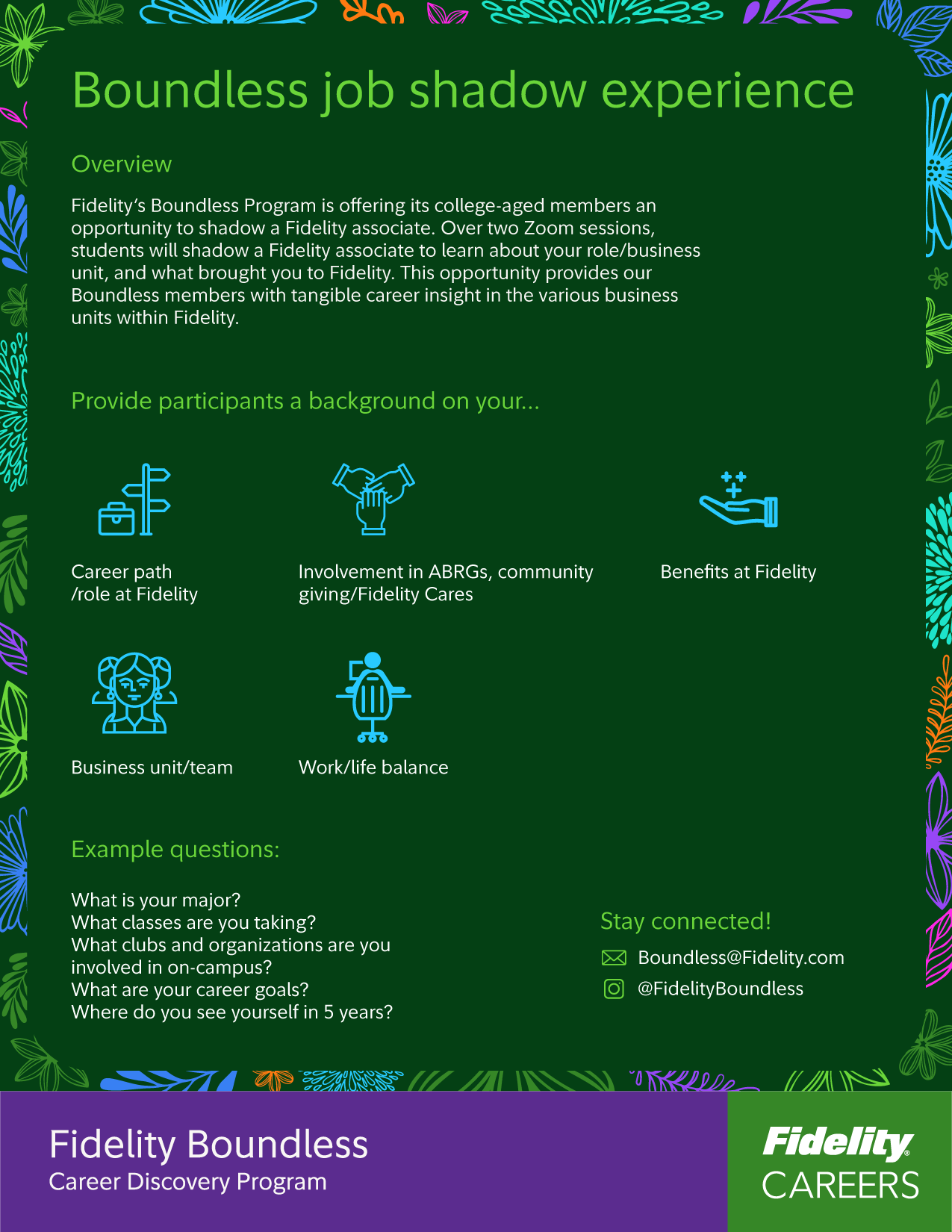
The Boundless program’s visual identity had drifted far from Fidelity’s brand system, creating inconsistency and making it harder to recognize as part of our ecosystem. Our goal was to realign it with Fidelity’s core design language while keeping it relevant and appealing to its primary audience—teen girls.
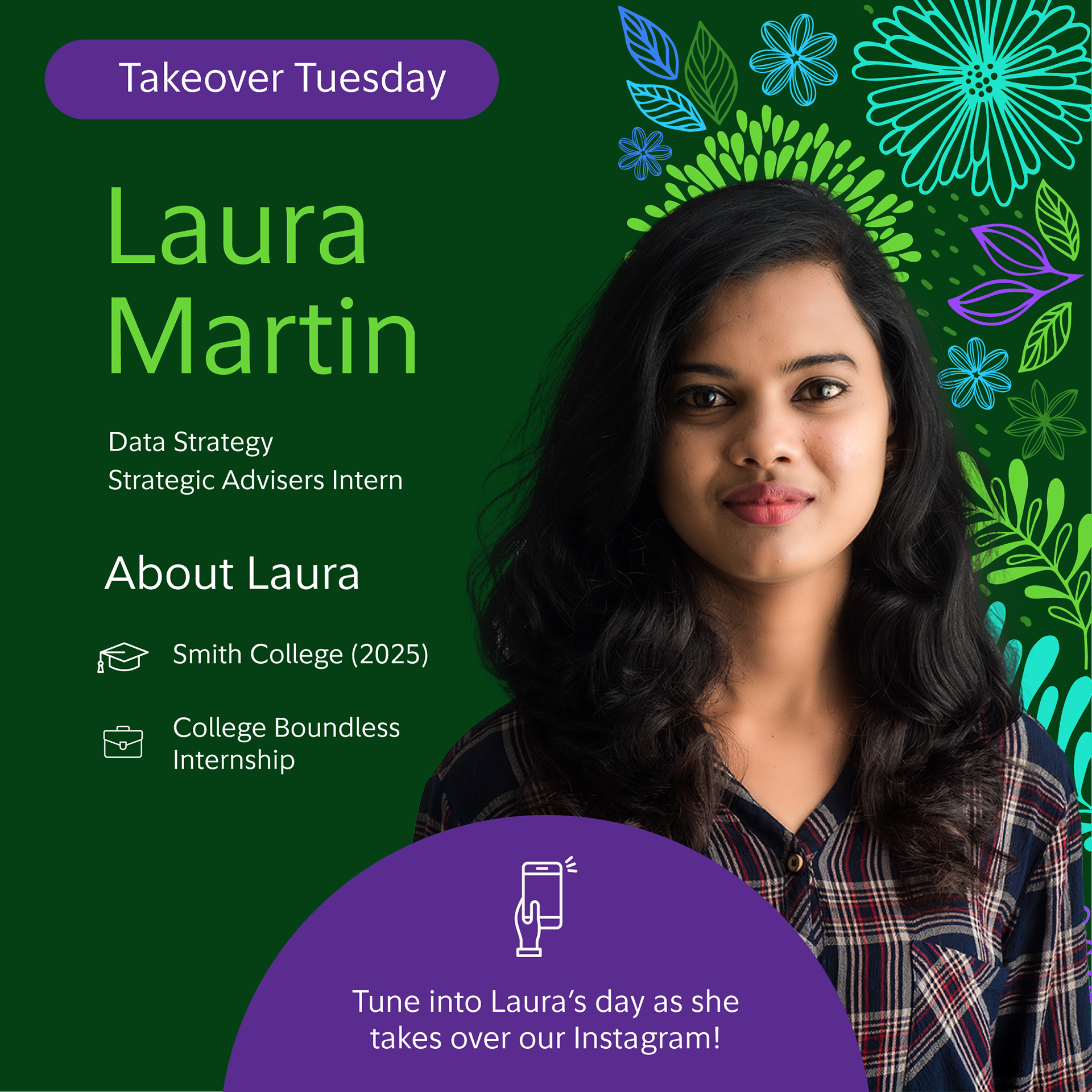
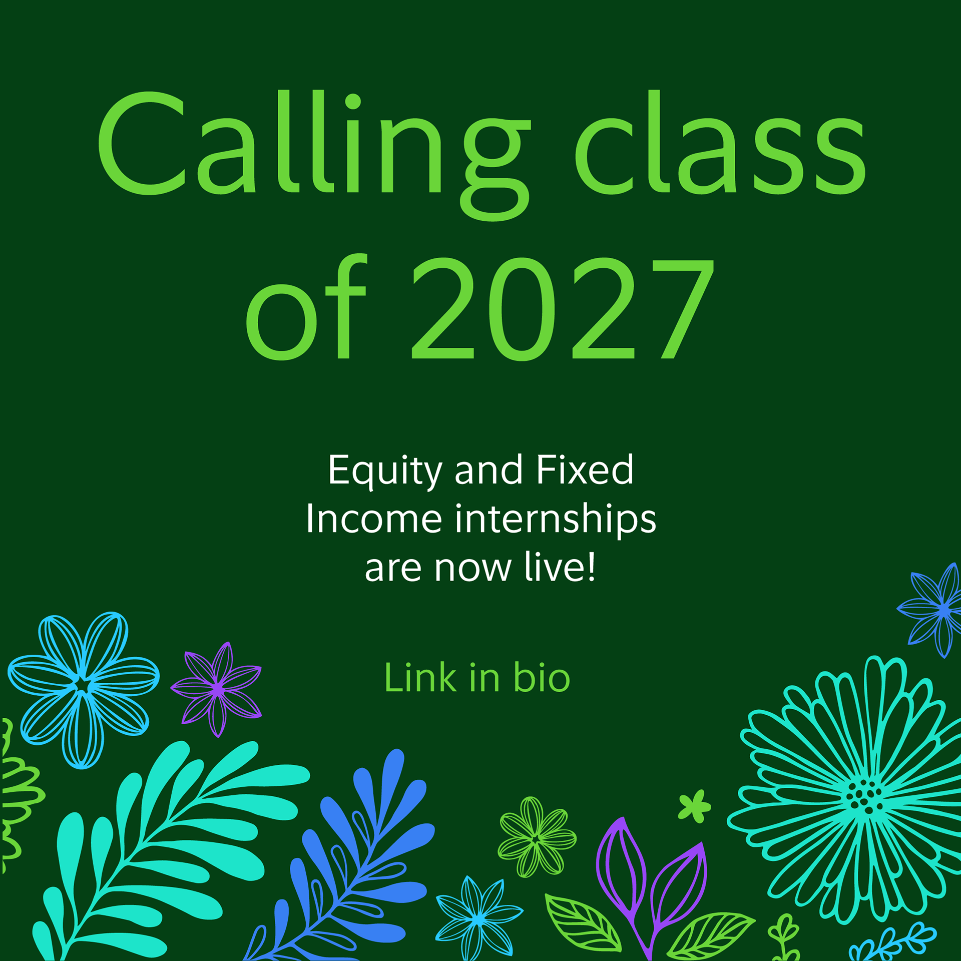
To maintain continuity, I kept the original purple as an anchor to the existing mental model. I then introduced a deep green background to reconnect it to Fidelity’s brand and create stronger contrast for typography and callouts. Finally, I incorporated floral elements using our secondary brand colors—adding a youthful, feminine energy without explicitly signaling “for girls only.”
Scroll down to see the before‑and‑after transformation.


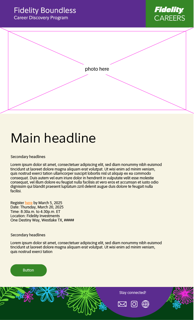


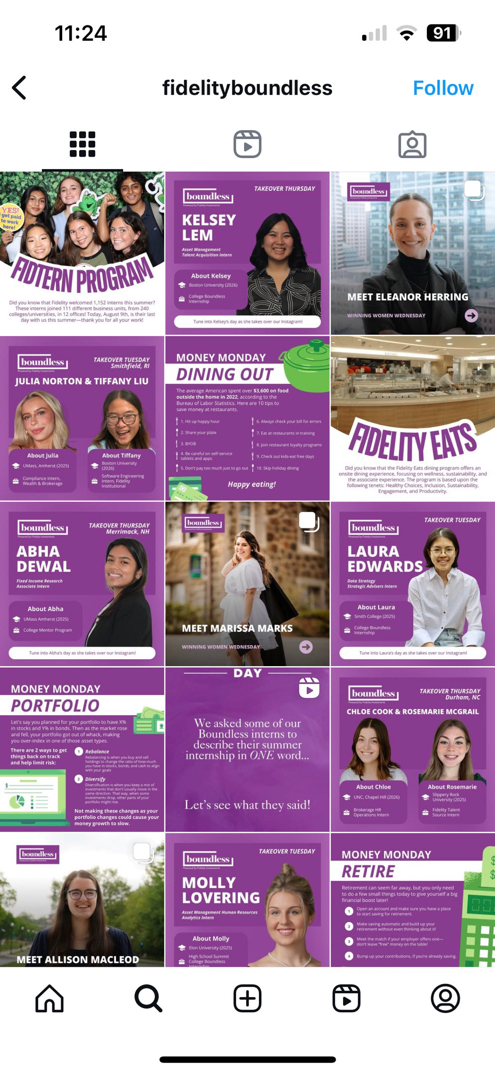
The old Boundless:
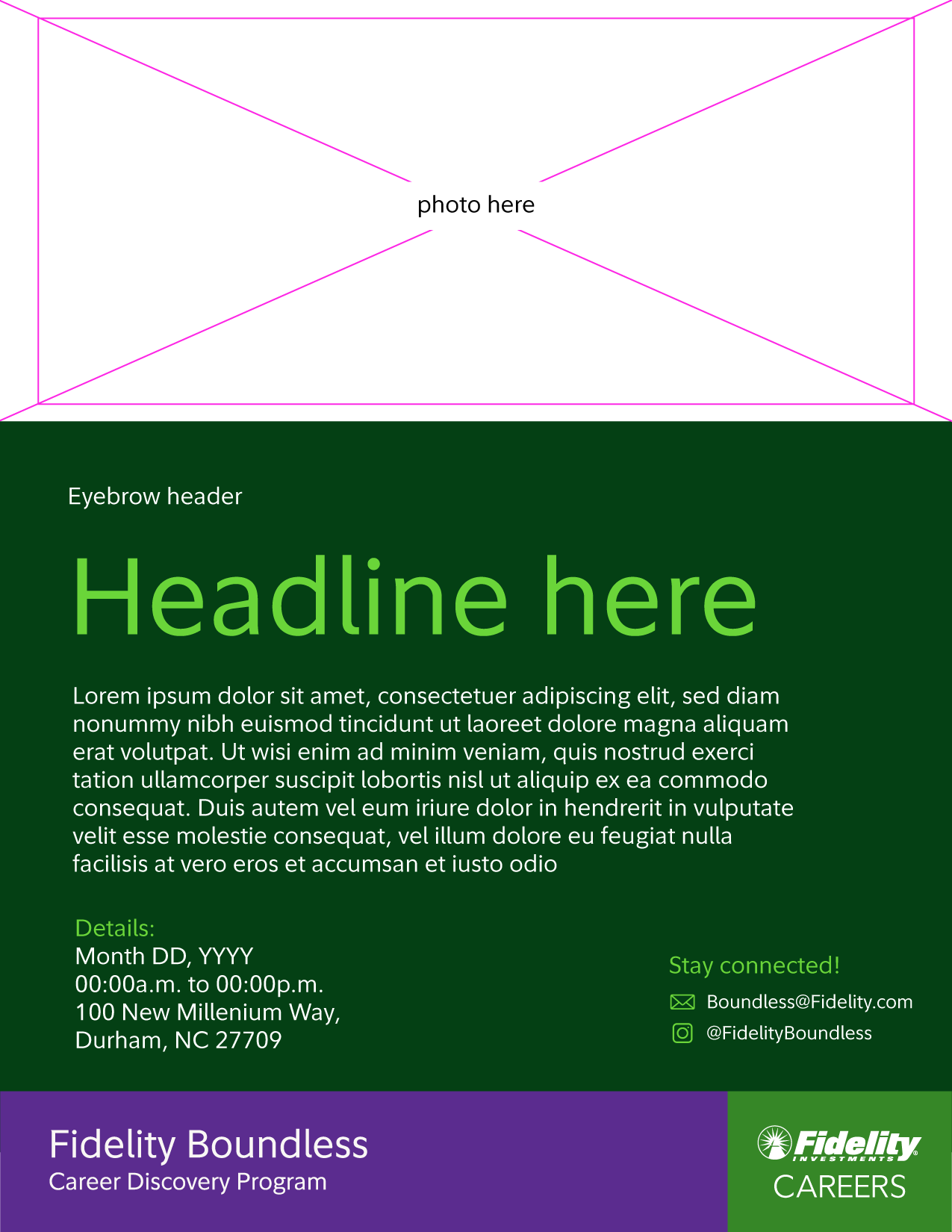
Concepts I explored: