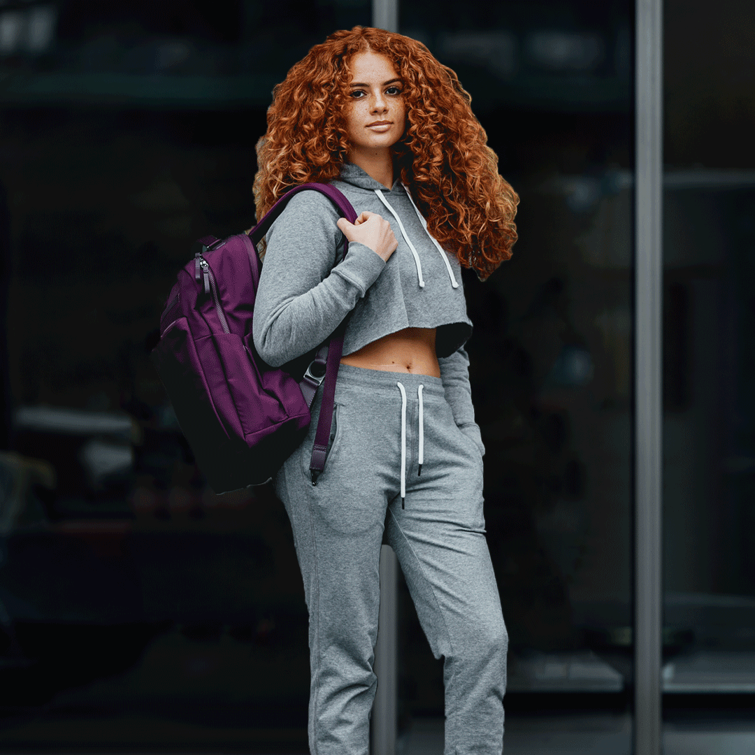
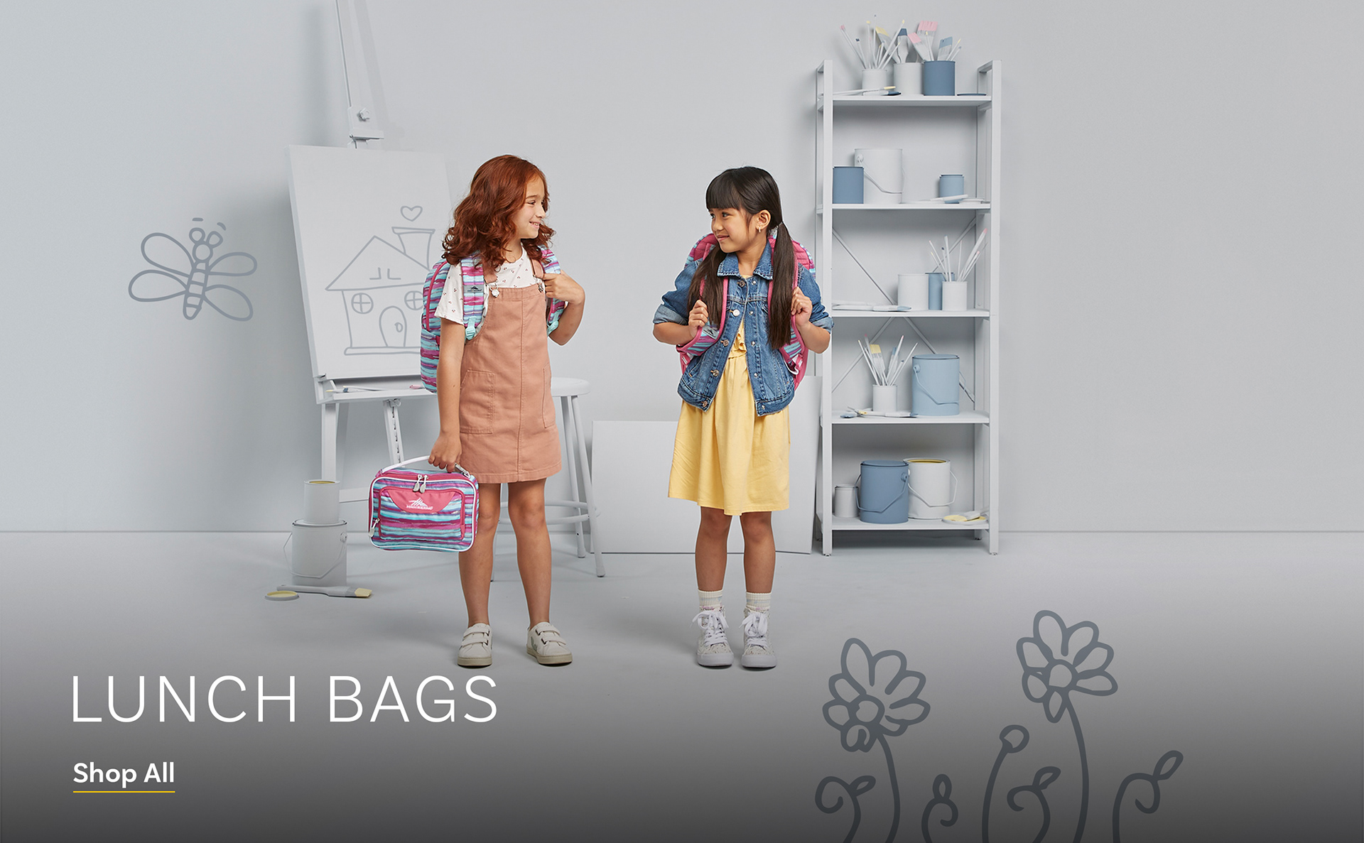
For High Sierra’s Back‑to‑School campaign, I partnered closely with our photography team to develop a concept that felt fresh, youthful, and true to the brand. At the time, the most recognizable element of High Sierra’s identity was the white‑and‑gray palette used on their product tags, so we built the visual system around that signature look to reinforce brand recognition.
To bring in a sense of imagination and play, we posed the models as if they were daydreaming—capturing that universal “back‑to‑school” feeling of possibility. In post‑production, I layered in motion‑driven doodles and illustrations that represented what they might be imagining. By designing these elements in a loose, handwriting‑style linework, the graphics felt personal and kid‑created, enhancing the campaign’s youthful energy.
The result is a cohesive, imaginative visual story that blends authentic photography with expressive design—bringing the High Sierra brand to life in a way that resonates with students and parents alike.


The tags we were inspired by: