
CAPSTONE PROJECT
Why I chose this project
My last semester at design school was my last chance to pick what I wanted to design, and I recognized this as a huge opportunity to showcase not only my creativity, but to demonstrate my understanding of design as a a marketing tool.
My father runs a small 'Safrus' business, which had no identity or branding. His business plan was to find clients via word of mouth. This was the perfect opportunity for me to work with a genuine business and design an entire identity as well as marketing tools that would be utilized and give me a chance to see the real effect of design on a small business.
Research
I started this project by conducting a lot of research. I learned about the trade, about competition, about the business, and about the traditions. The most compelling information I found was that not one single 'Safrus' business in the states has a proper branding system, so I knew this would be a strong opportunity for growth for my Father's company.
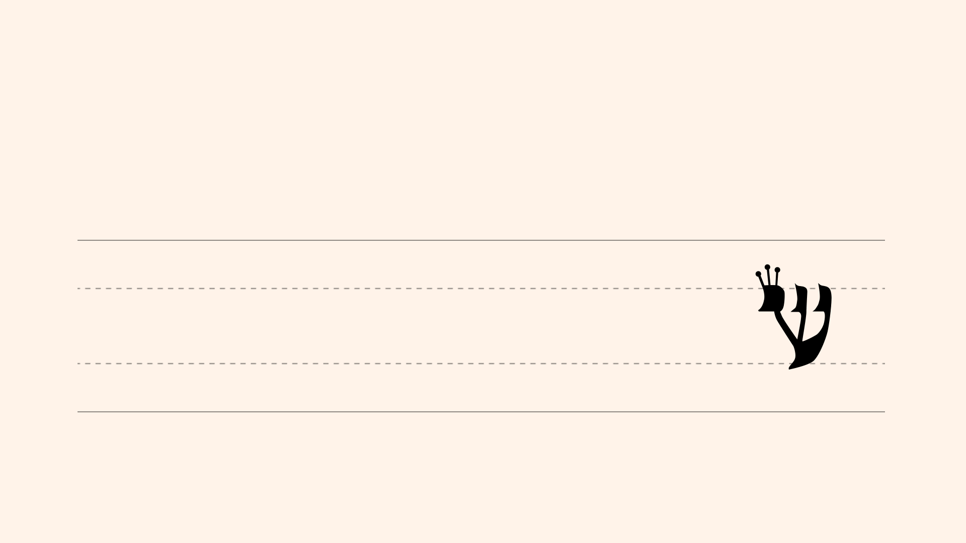
In order to begin, I watched my Dad's process - below is a short clip of what it looks like when he uses his hand-carved quill and hand-mixed ink to write on the prepped parchment. This practice has been an important practice in Judaism since the start of the religion.
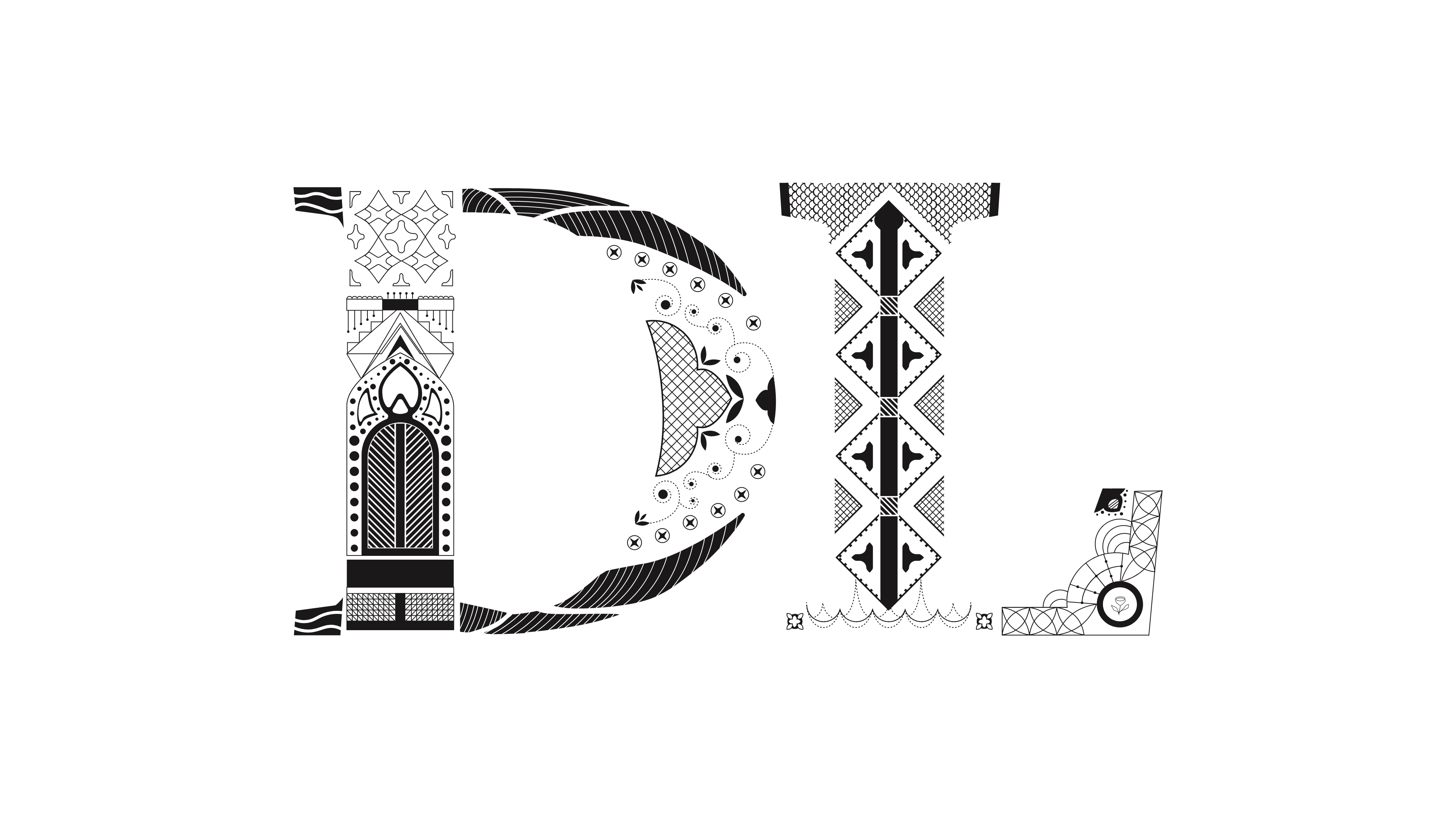
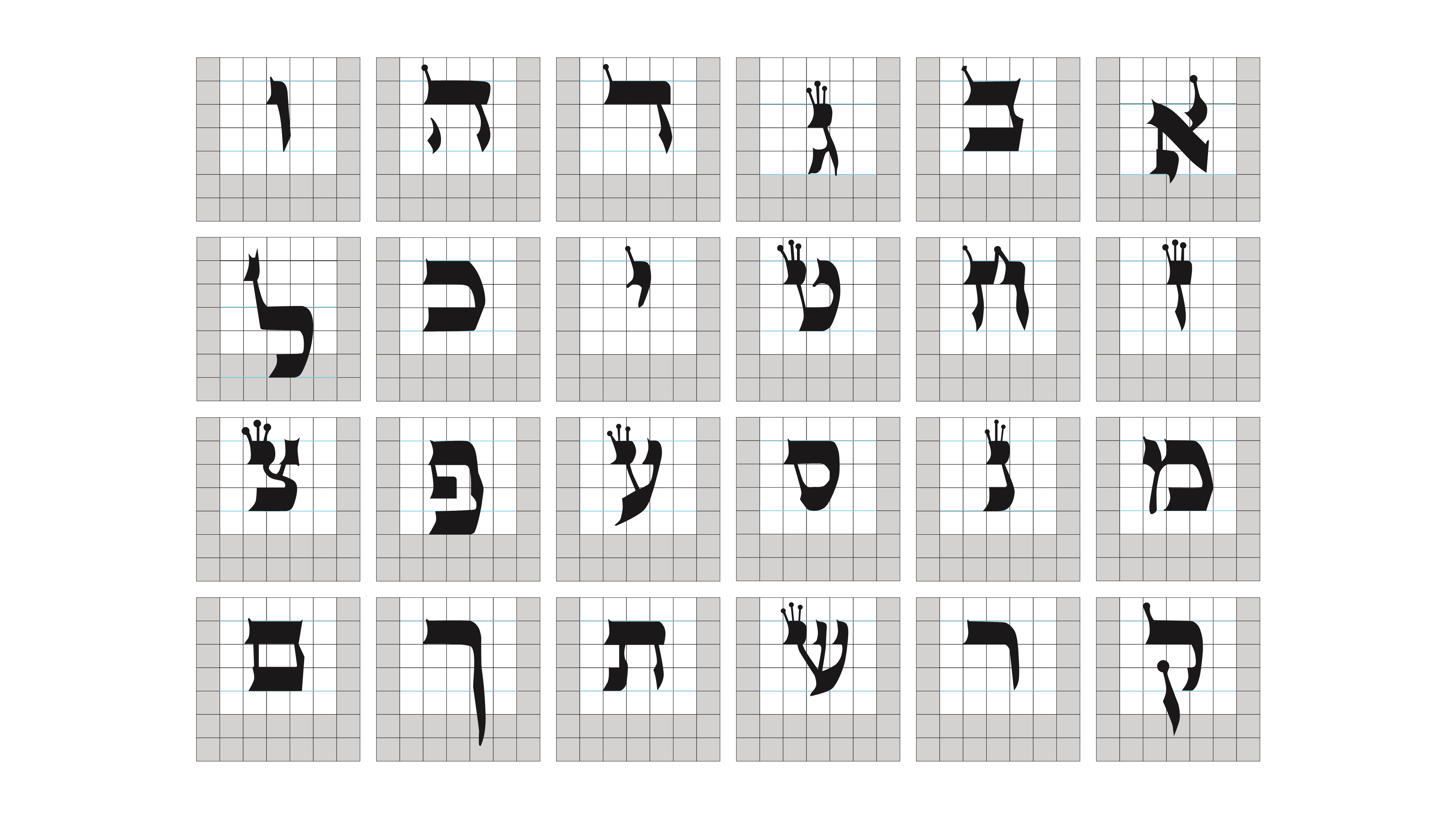
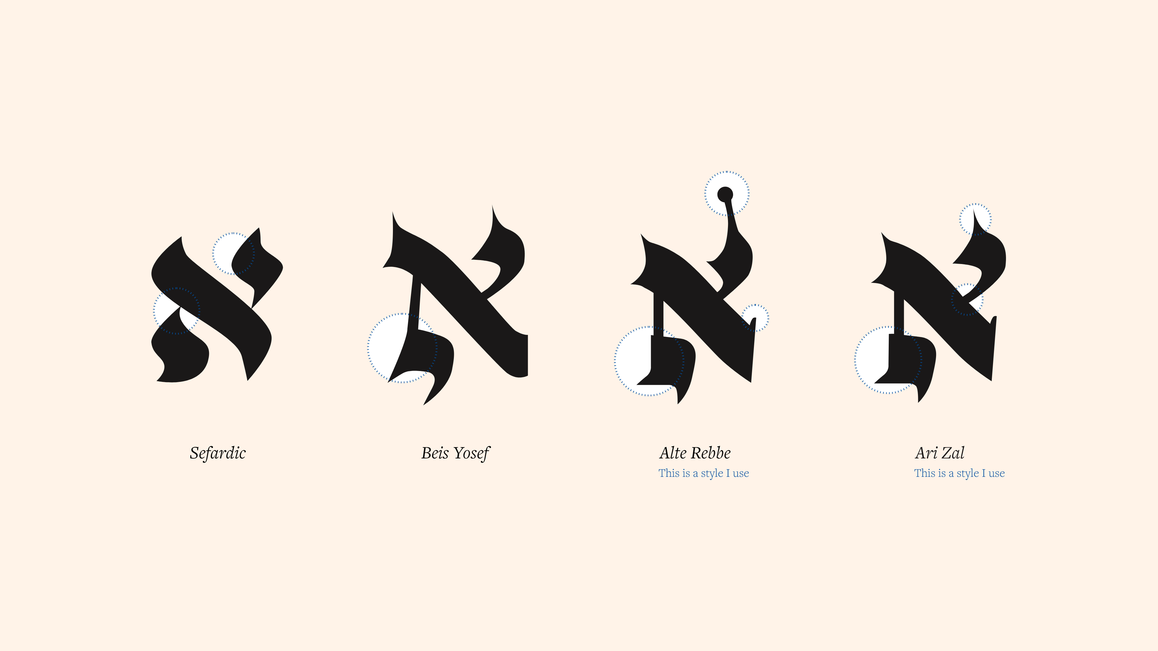
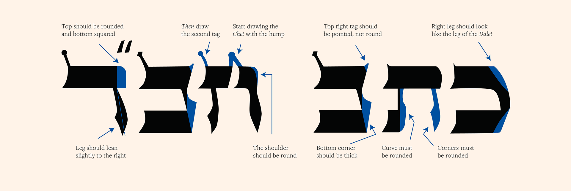
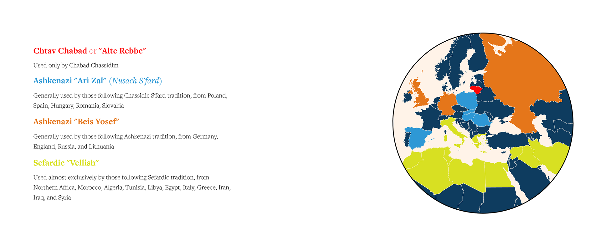
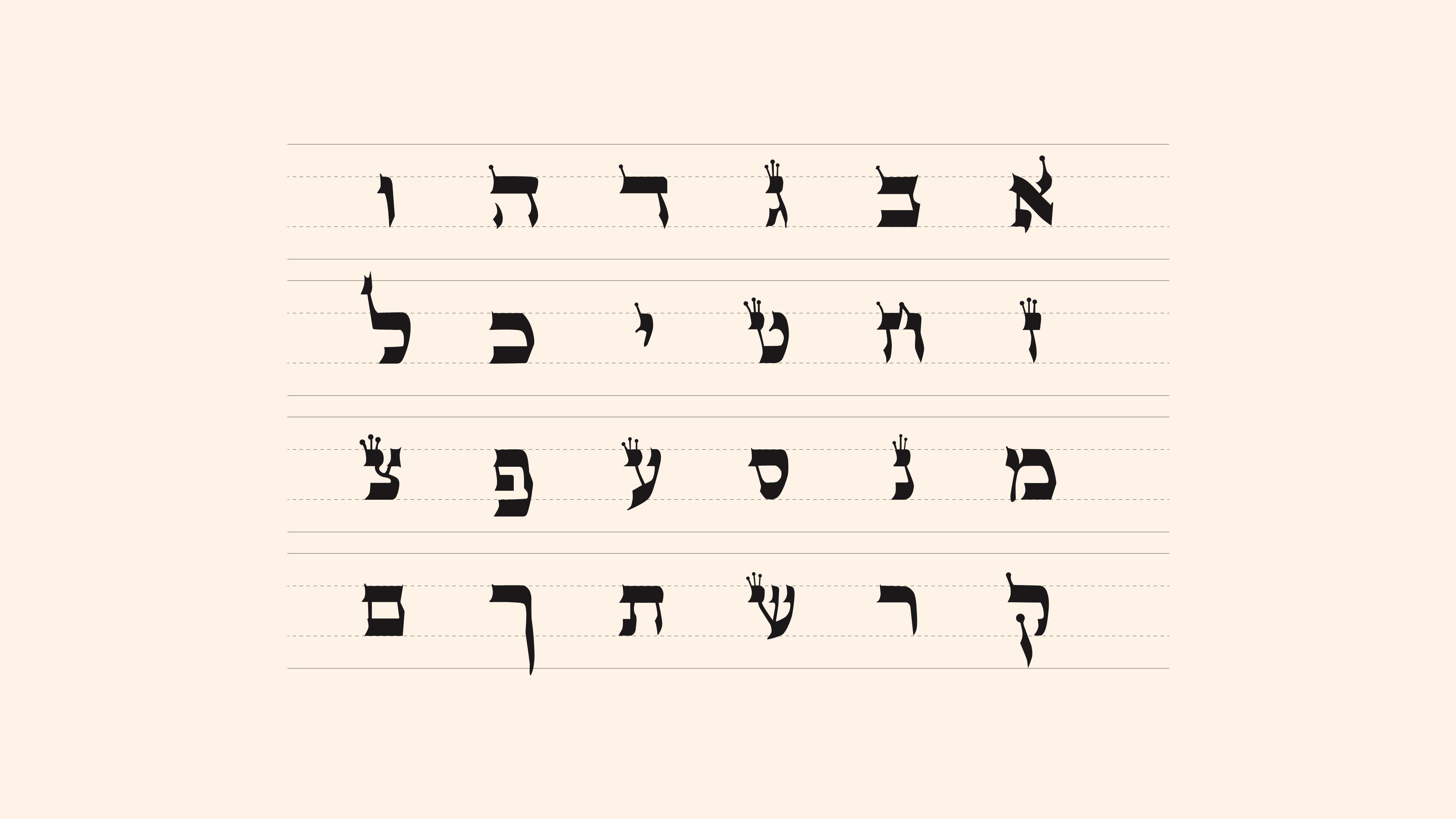
I learned that overwhelmingly, clients pick their 'Safrus' agency based on writing style. I decided to incorporate the specific style of lettering that my Dad uses into the design and branding. I started by studying the letterforms straight from the book my Dad learned from. I vectorized the letterforms and tried to understand the differences it has to other Safrus styles.
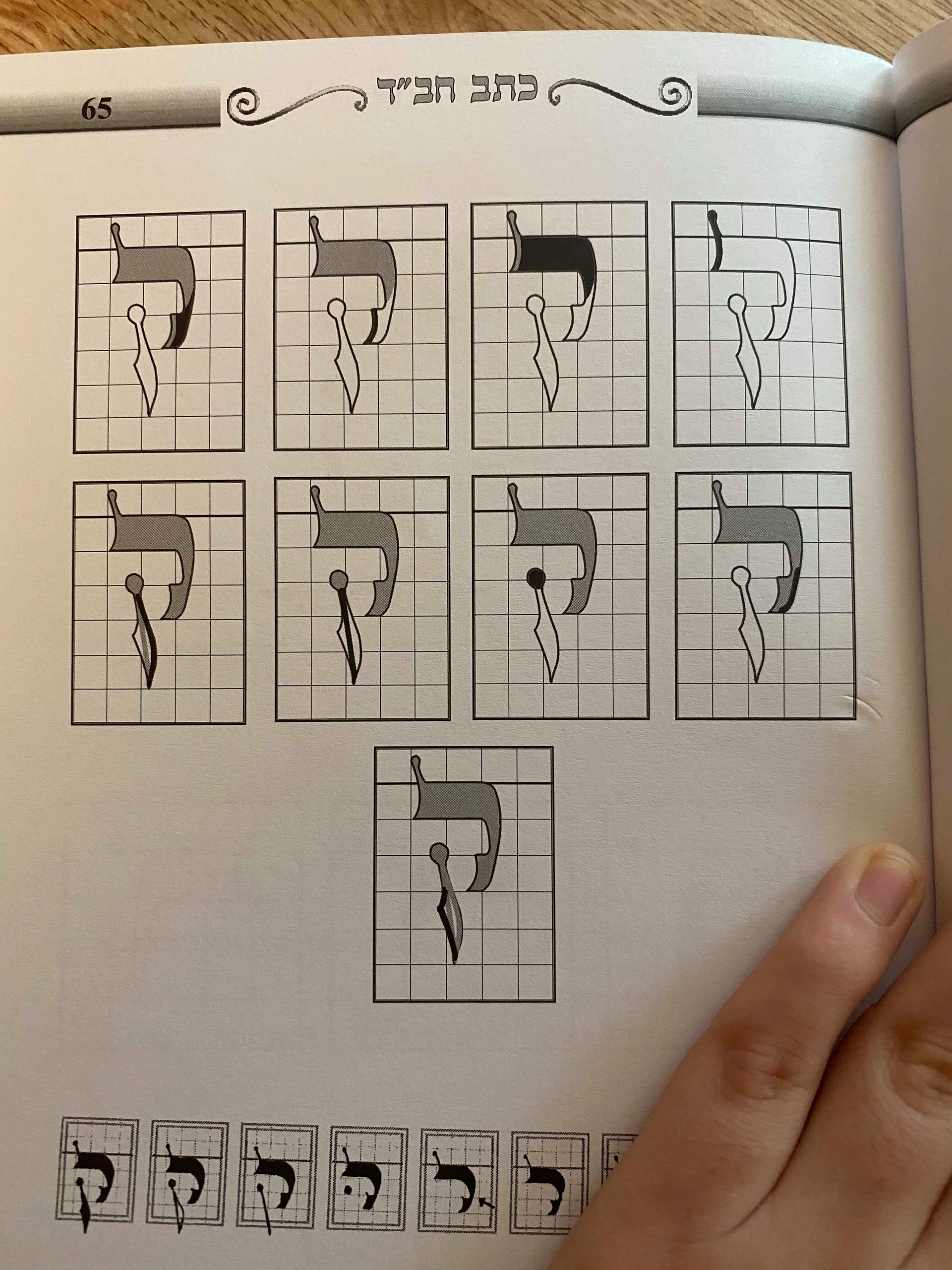
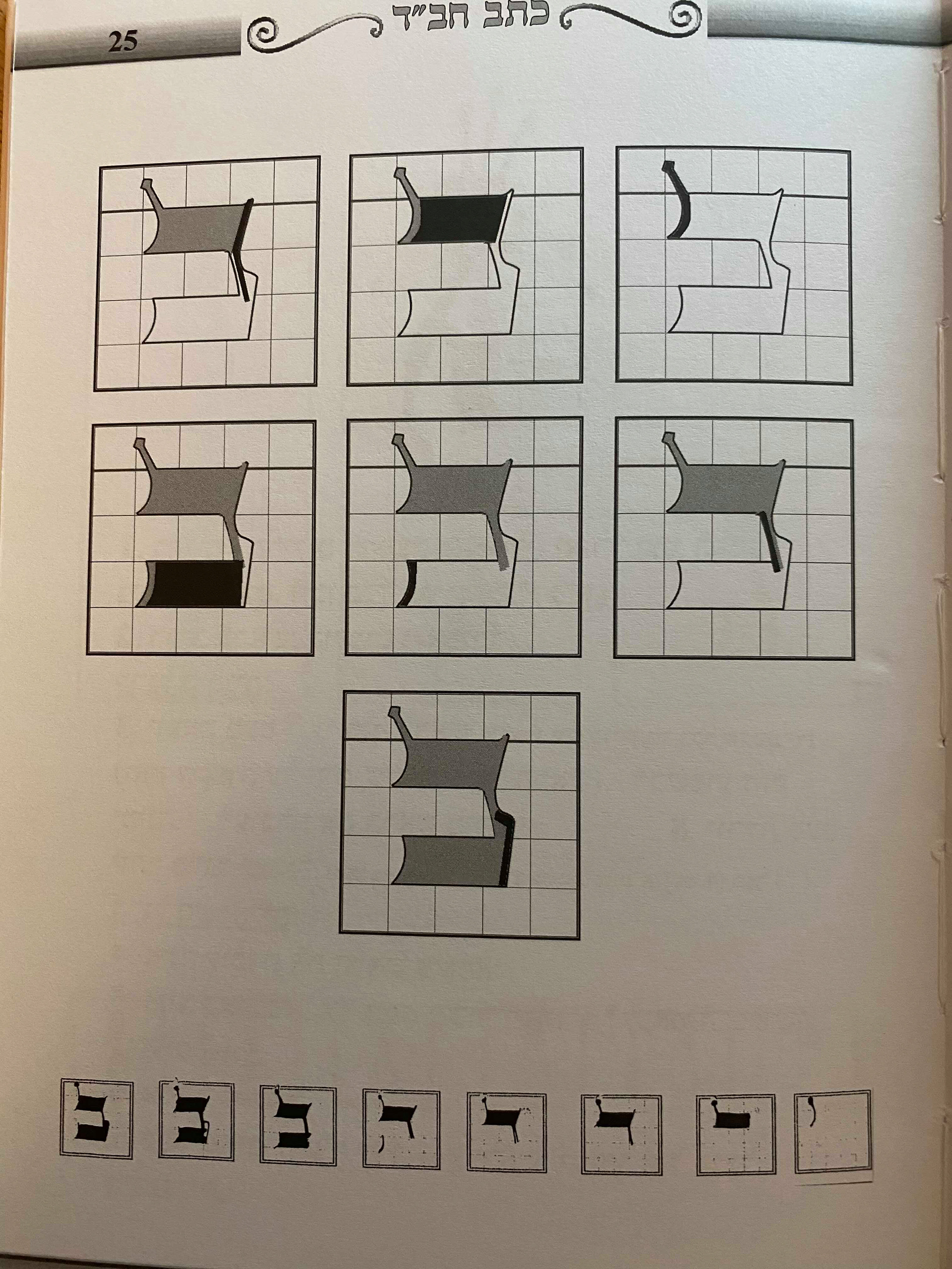
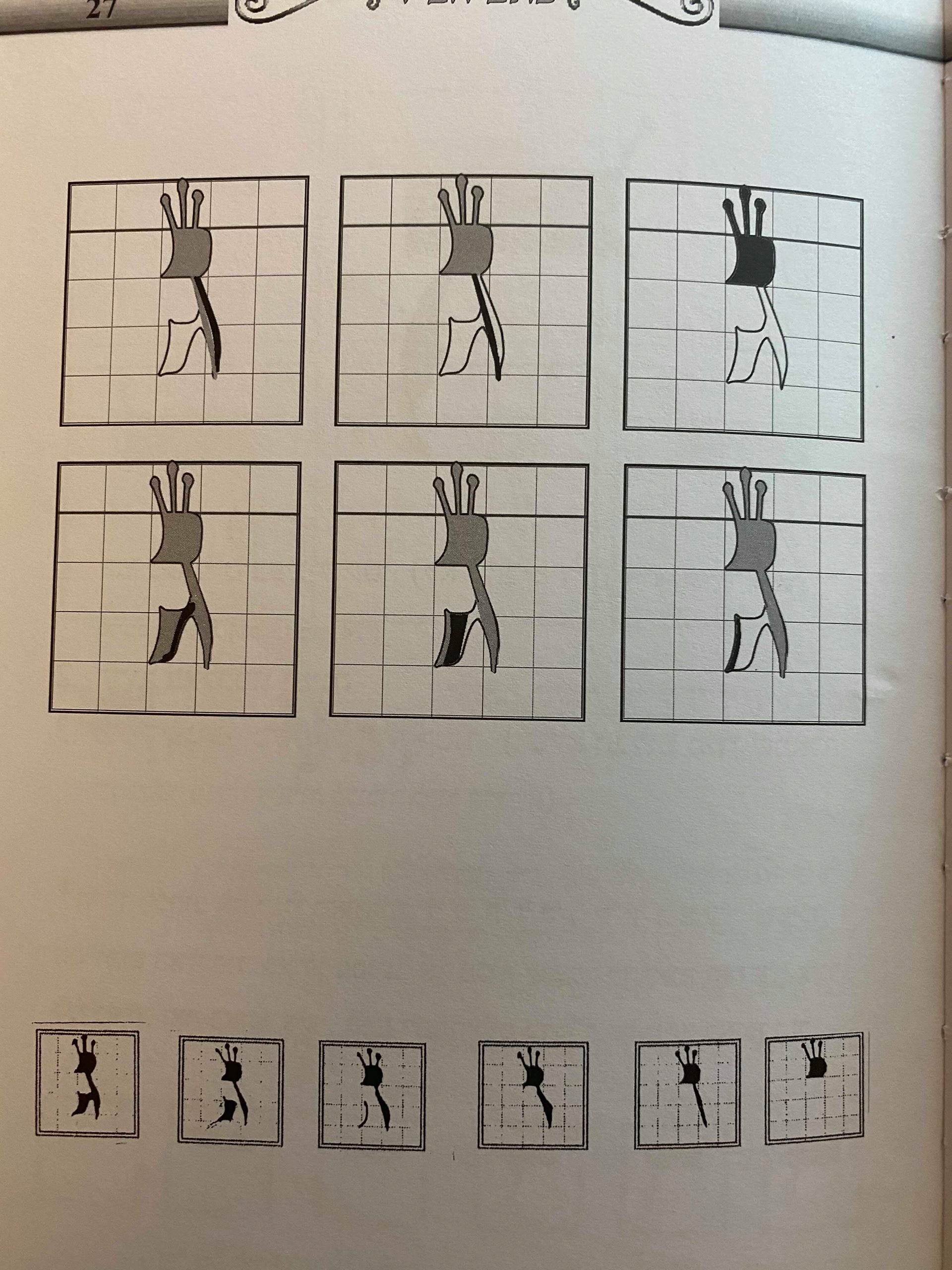
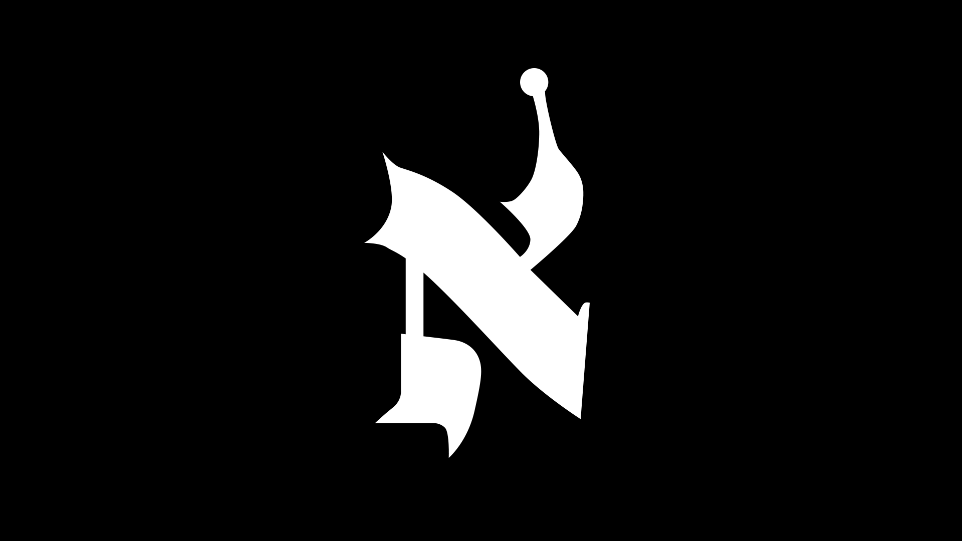
Below is a graphic I created to highlight the differences in the letter ALEF across the 4 major styles used in the Jewish practice.
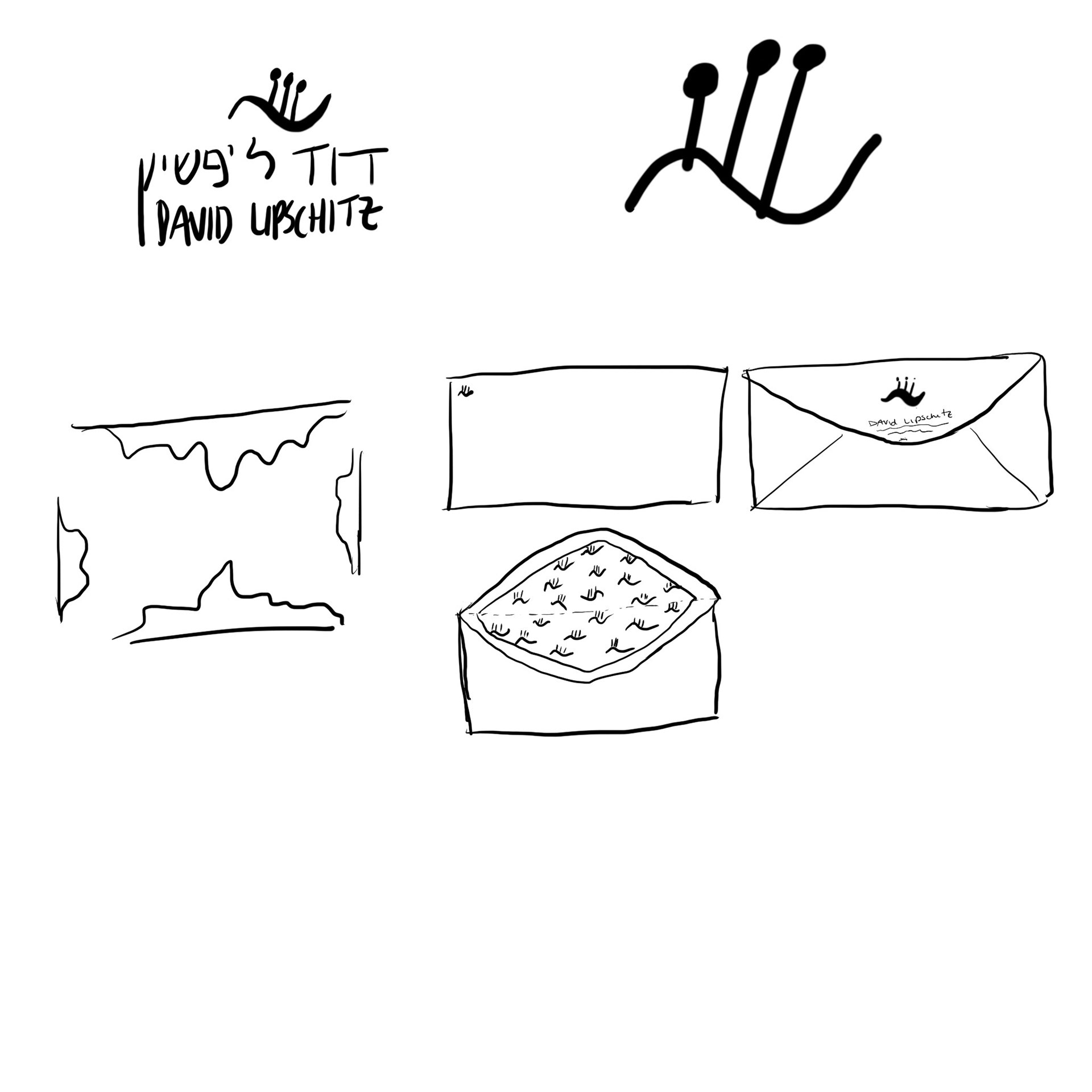
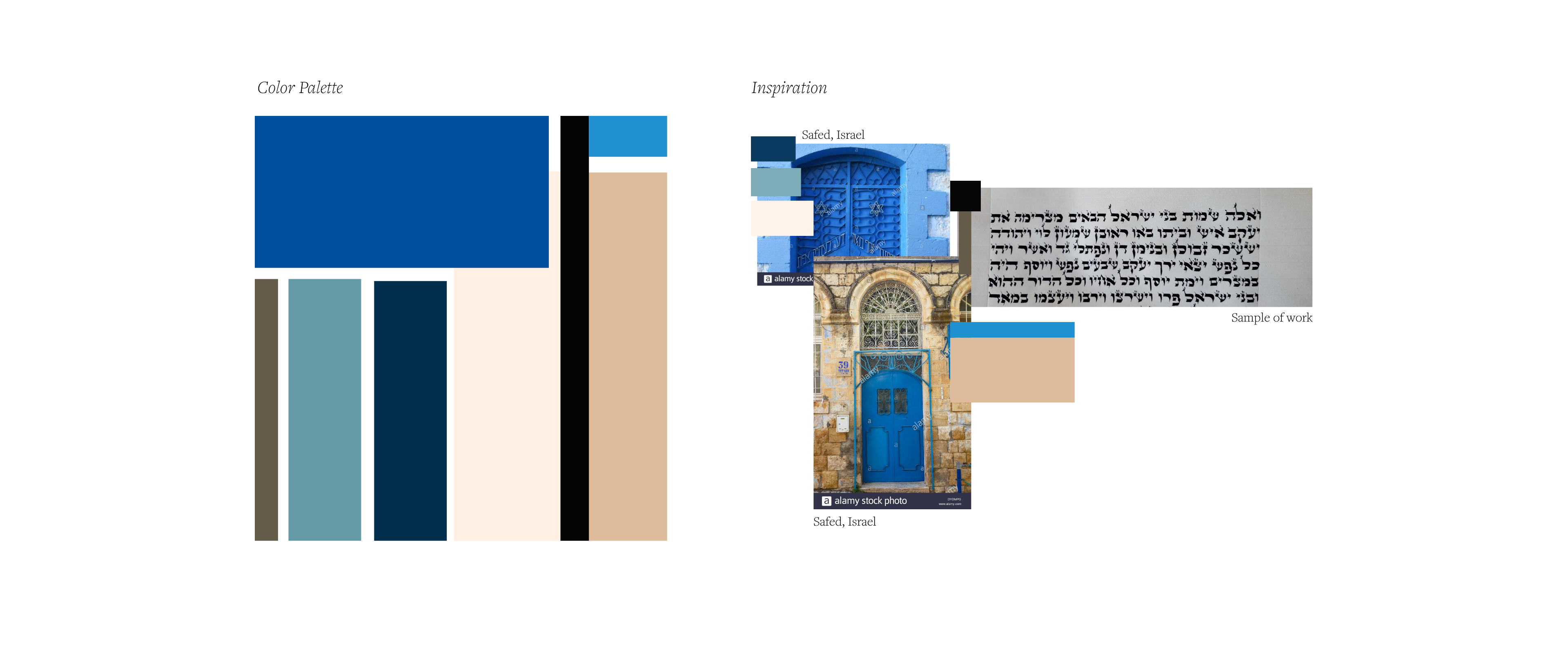
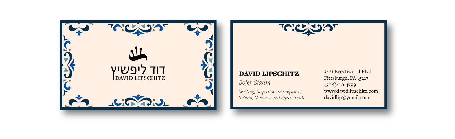
The Logo and Colors
Once the letters were vectorized and I felt I had a good amount of research done, I started designing. inspired by my Dad's style of writing, which has a special emphasis on the points on top of letters (line and dot), I created the wavy icon, which is not a specific letter, rather symbolizes his style of writing. The logo then has my Dad's name in Hebrew followed by his name in English. Many of his clients will read both languages, others will only be able to read one.

The colors are inspired by the tans and blues of the Israeli village where my Father learned to become a Sofer, where he had his first office, and where I was born and lived for the beginning of my life. I also wanted to include the tans and black from the parchment and calligraphy.
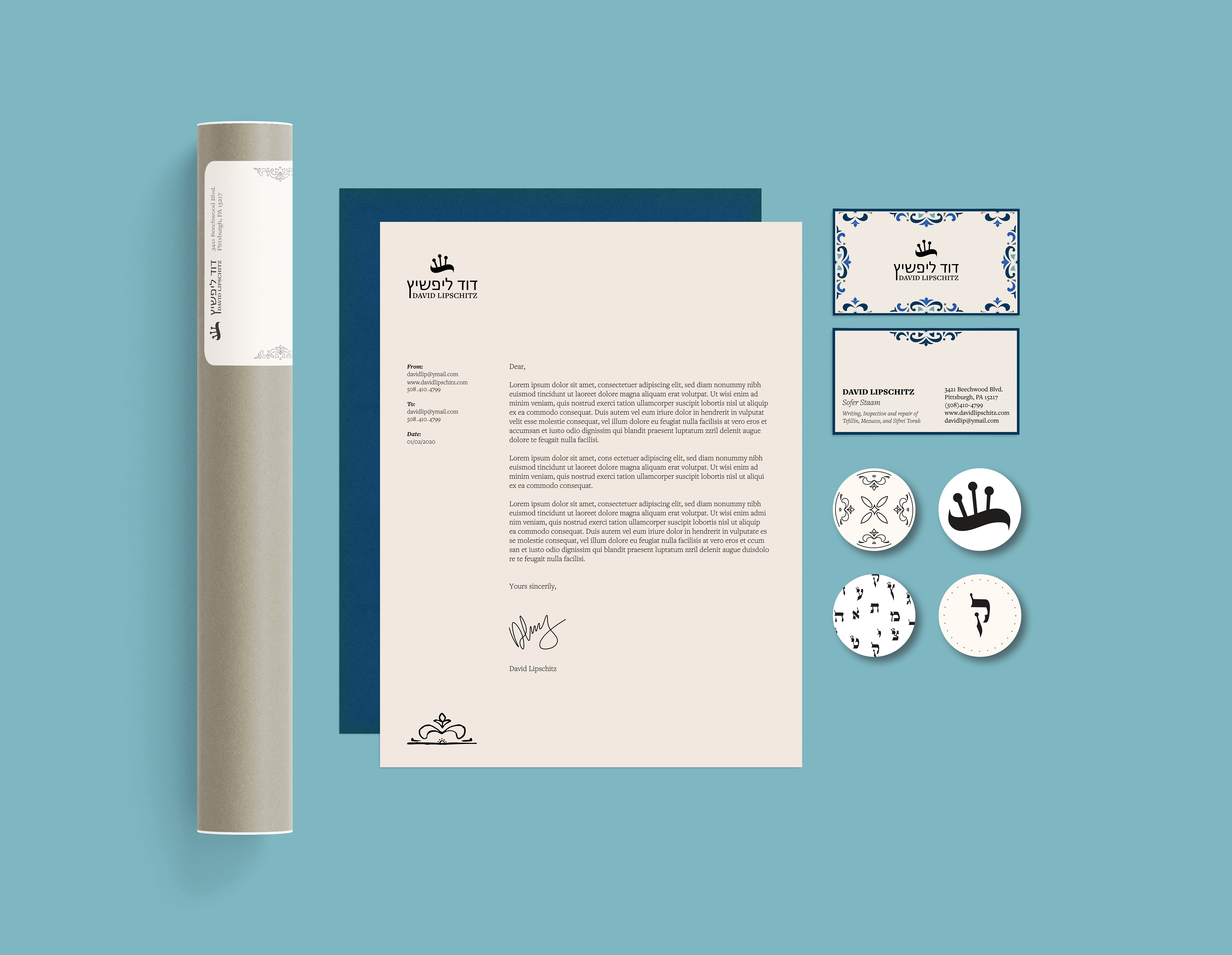
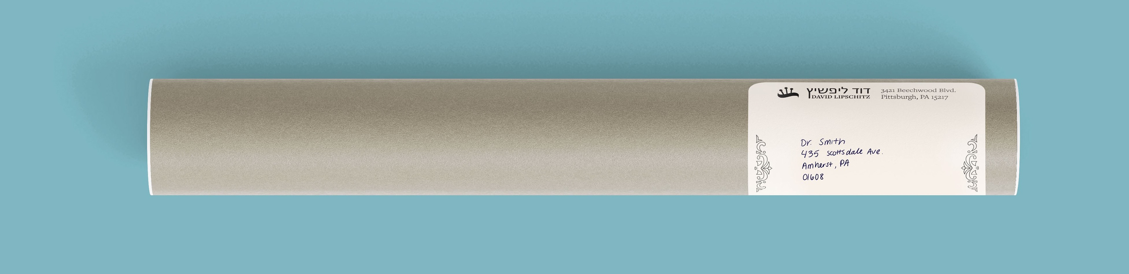
Branding
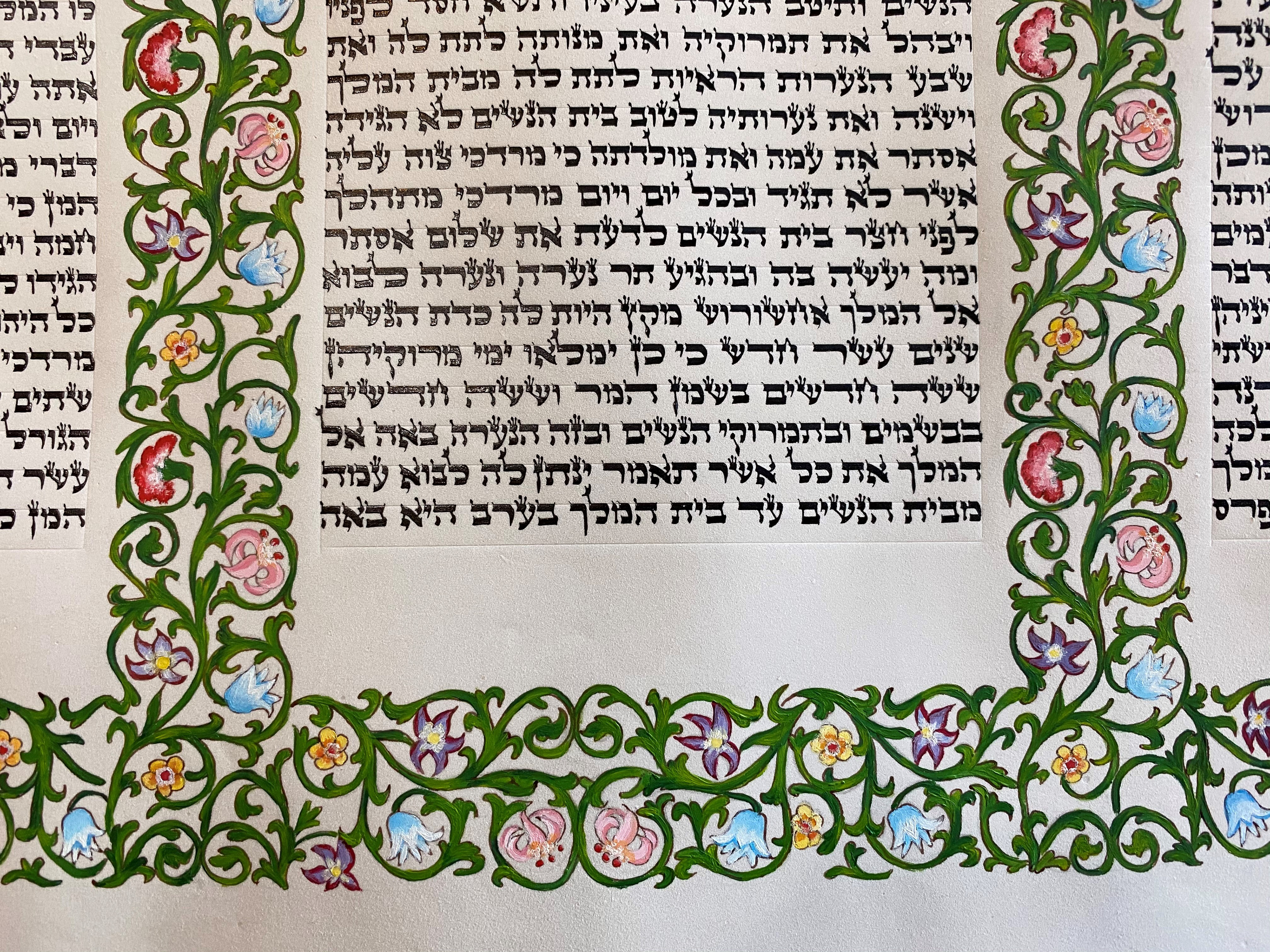
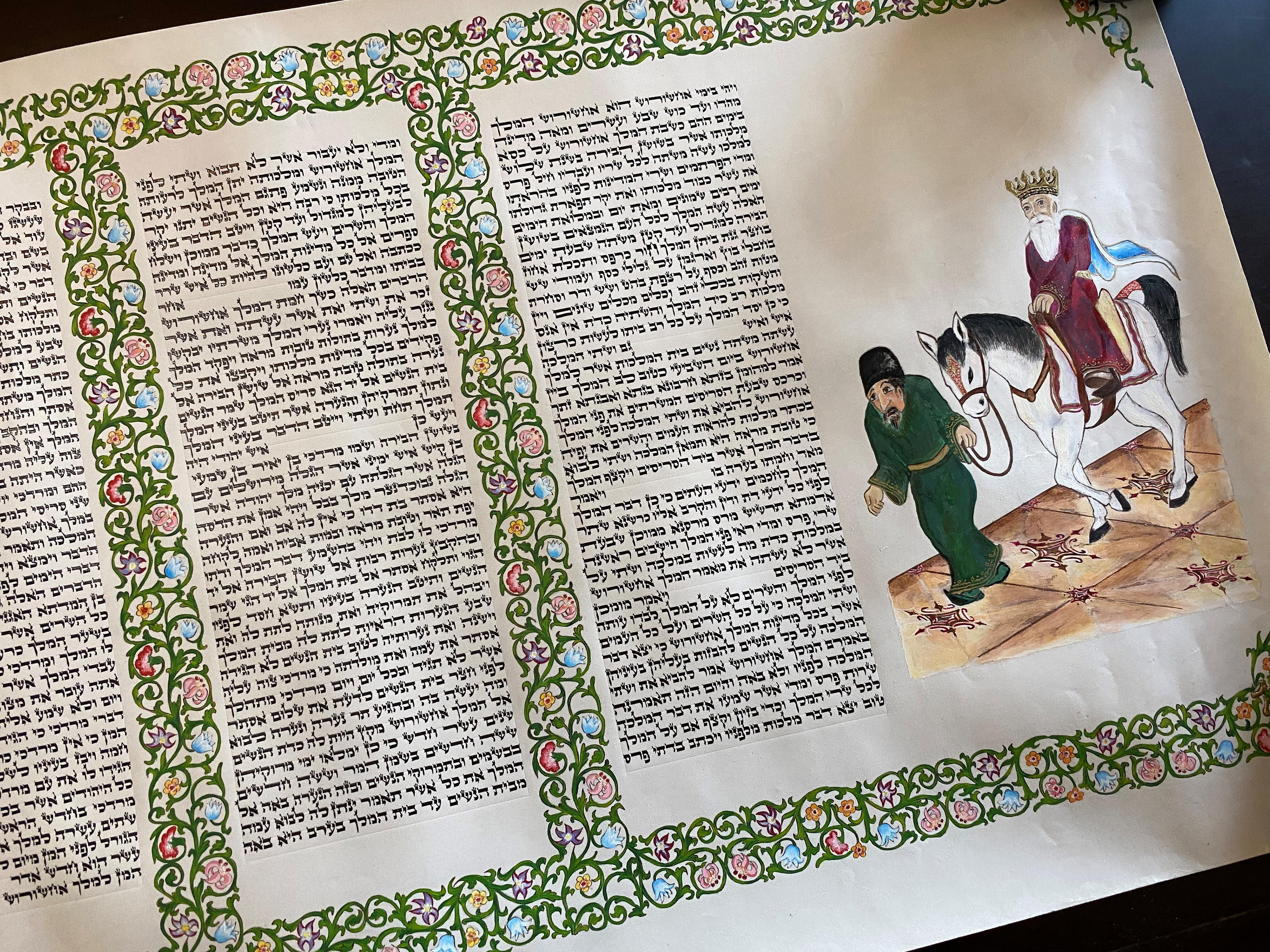
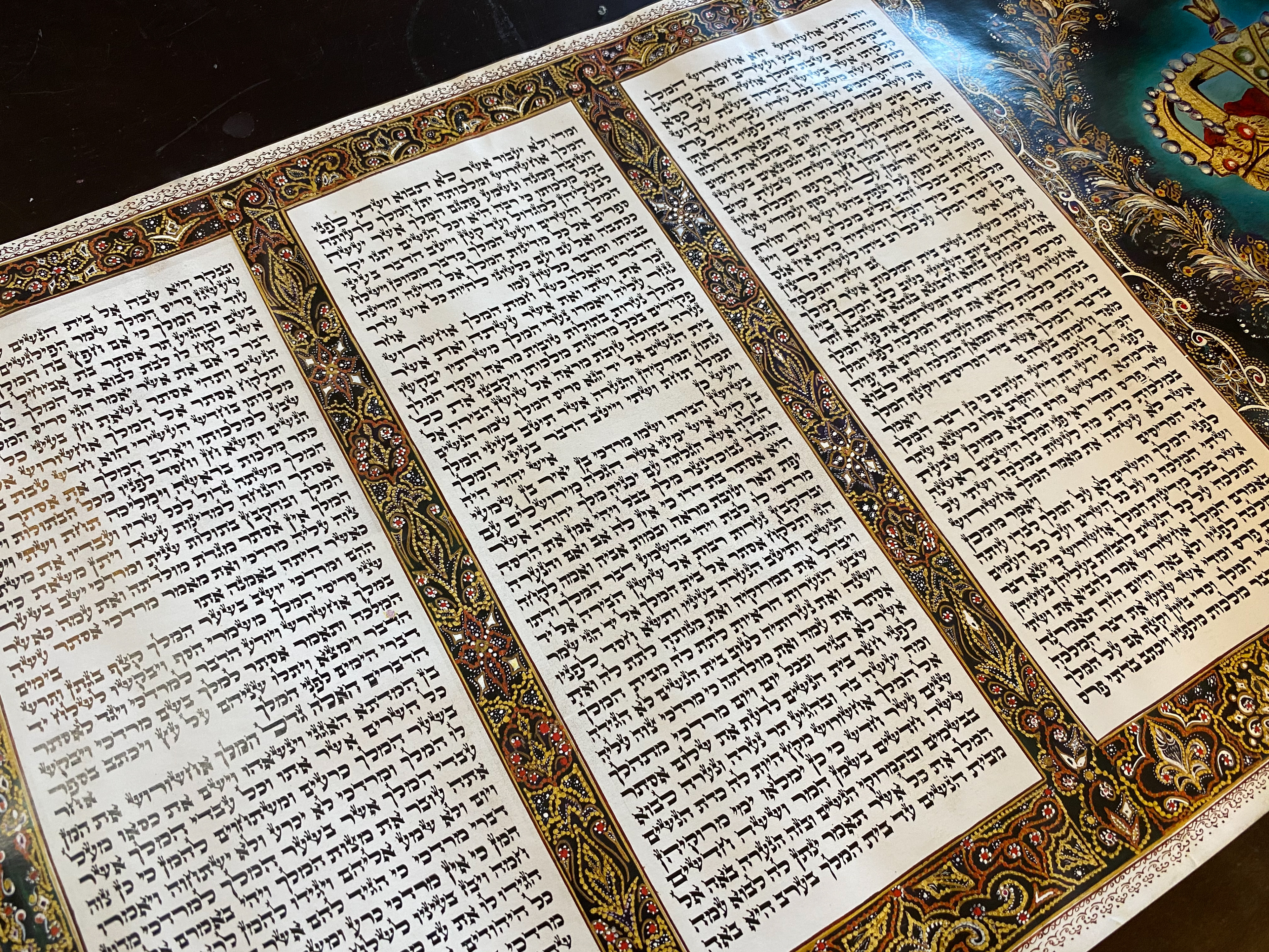
Once I had a solid logo and color scheme, I started by designing the business card. Most of the work my Dad does is simple black lettering on parchment, but there are times where he works with artists to create beautiful illuminated manuscripts (example below). I took inspiration from these for the cards.
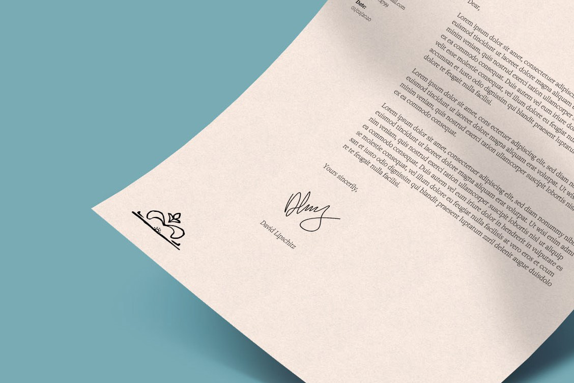
The website
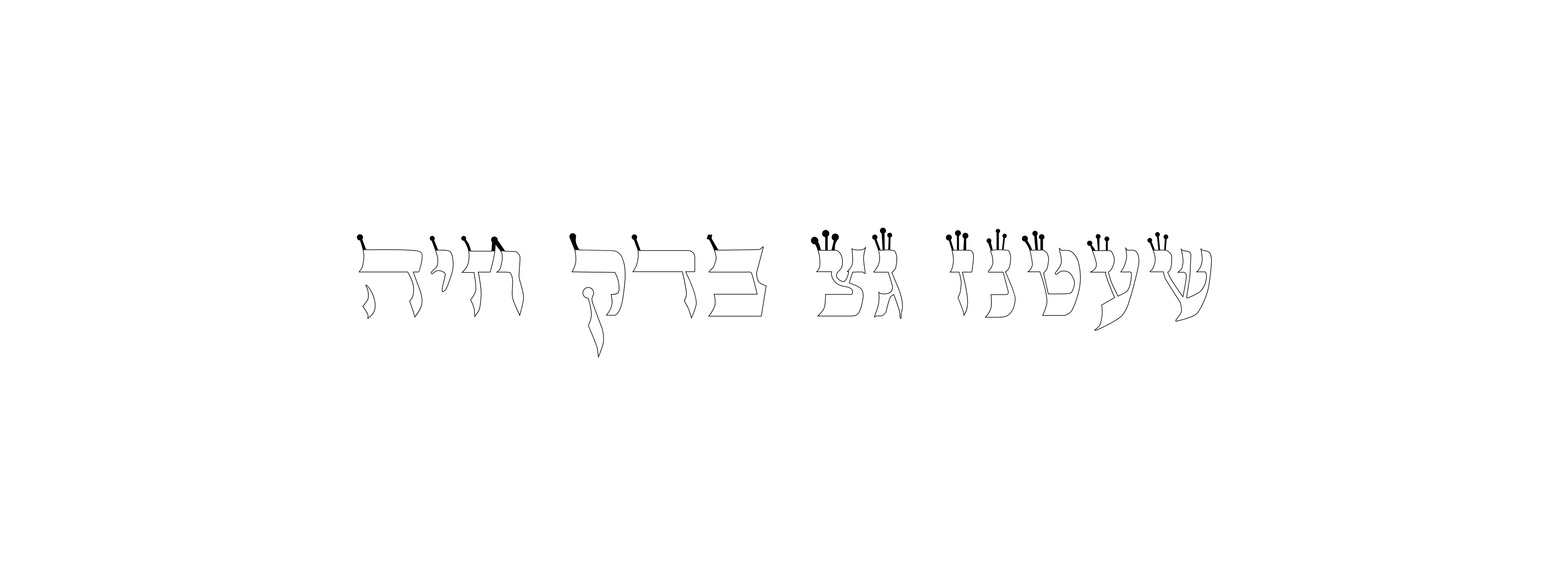
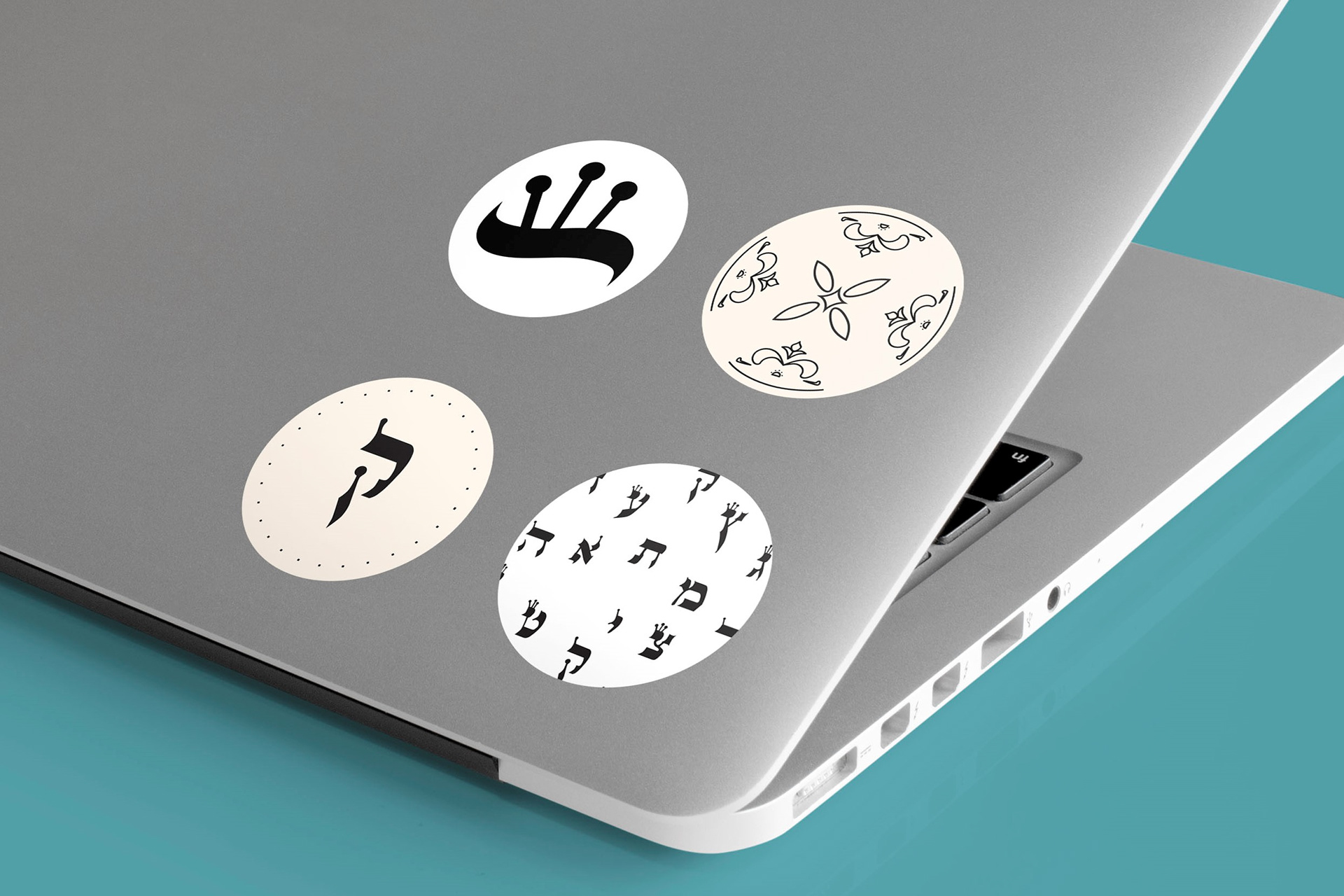
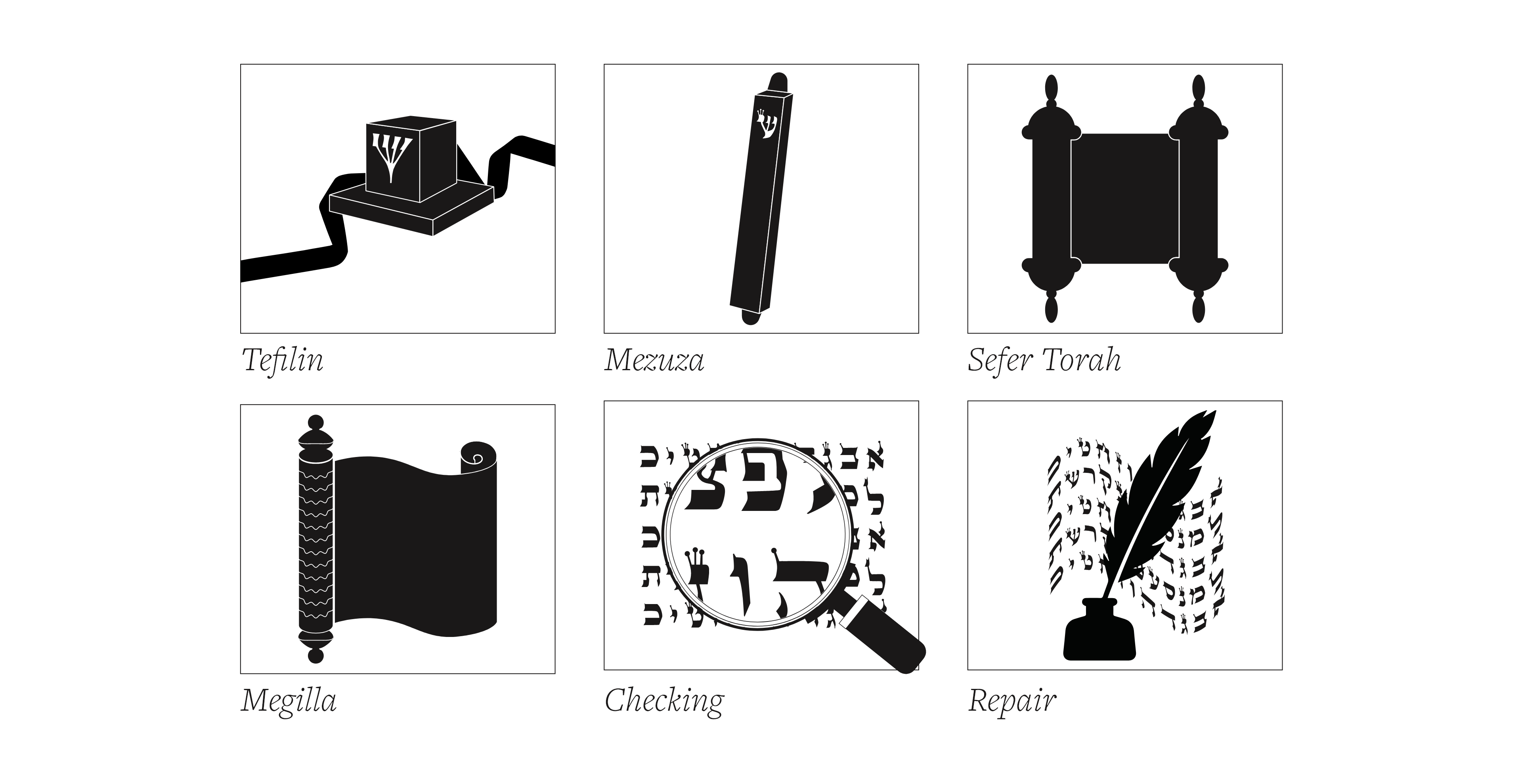
Once I had the print collateral all set, I started building a functional website. The purpose was to grow my Dad's clientele. The website is designed to serve anyone from beginner to expert. For this reason, there is a large focus on education on the site, but the landing page is intended for sales. I designed the below pictographs, which illustrate foreign language for those who aren't familiar with the terminology.
To see more from the webiste, click the link below:
While this "font" was designed thousands of years ago for the purpose of a scribe writing holy scripture, this may be the first instance of it being vectorized and used in a digital environment.
Some preliminary sketches: